Gotham Narrow Thin Italic
Designed by Tobias Frere-Jones
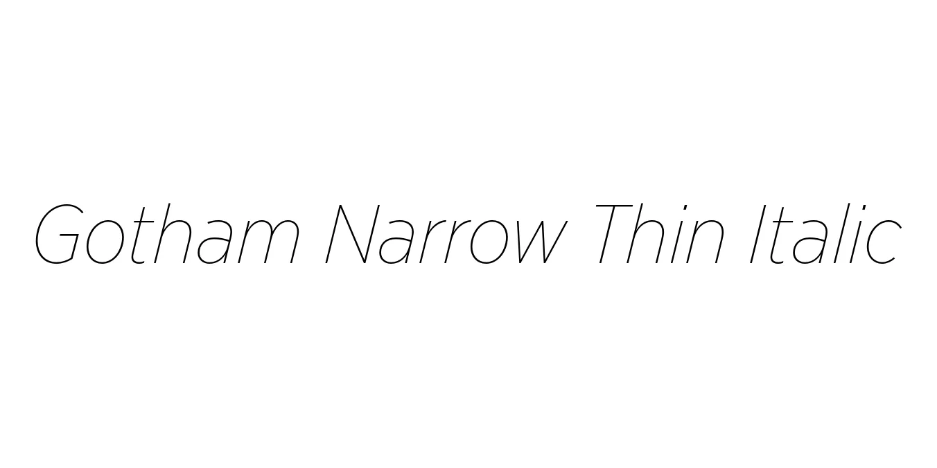
| Font Name | Gotham Narrow Thin |
| Style | Italic |
| Category | Sans Serif |
| Designer | Tobias Frere-Jones |
| Copyright | Copyright (C) 2005, 2008 Hoefler & Frere-Jones. http://www.typography.com |
| License | Commercial License Required |
| Total Character | 342 |
| Recommended Line Height | 1.2 |
| Ascent | 960 |
| Descent | 240 |
| Units Per em | 1000 |
| Total Vertical Range | 1200 |
| Max Advance Width | 1056 |
| Max Advance Height | N/A |
| Underline Position | -75 |
| Similar Fonts | Montserrat, Proxima Nova, Museo Sans, Armonioso |
Gotham Narrow Thin Italic Font Details : Font Free Download
Gotham Narrow Thin Italic is an elegant extension of the iconic Gotham family, originally designed by Tobias Frere-Jones. Inspired by the architectural and industrial lettering of mid-century New York City, the Gotham family has become a modern typographic standard. The Narrow variant was specifically developed to offer the same geometric honesty as the original Gotham but with a more condensed footprint, allowing for high-impact communication in tighter layouts.
The Thin Italic weight brings a delicate, sophisticated air to the family. Its slender strokes and graceful slant make it a favorite for high-end editorial work and luxury branding where a sense of movement and refinement is required. While Gotham was famously born from a commission for GQ magazine, this specific style has since evolved into a versatile tool for designers seeking a balance between urban grit and high-fashion elegance.
Gotham Narrow Thin Italic Best Uses
Perfect for sophisticated magazine headlines and stylish pull-quotes.
Ideal for high-end fashion labels and luxury lifestyle corporate identities.
Great for elegant hero text and minimalist navigation elements.
Excellent for minimalist promotional campaigns and premium product packaging.
Gotham Narrow Thin Italic Glyphs

Download Font
Package Size: 157.9 KB
Available Formats: .OTF