Gotham Narrow Ultra Regular
Designed by Tobias Frere-Jones
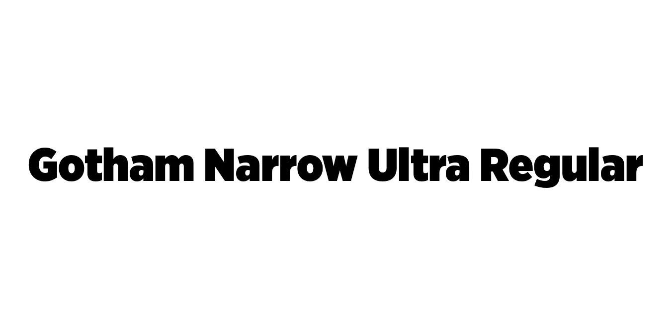
| Font Name | Gotham Narrow Ultra |
| Style | Regular |
| Category | Sans Serif |
| Designer | Tobias Frere-Jones |
| Copyright | Copyright (C) 2001, 2008 Hoefler & Frere-Jones. http://www.typography.com |
| License | Paid / Commercial License Required |
| Total Character | 342 |
| Recommended Line Height | 1.2 |
| Ascent | 960 |
| Descent | 240 |
| Units Per em | 1000 |
| Total Vertical Range | 1200 |
| Max Advance Width | 1185 |
| Max Advance Height | N/A |
| Underline Position | -75 |
| Similar Fonts | Montserrat, Proxima Nova, Nexa, Metropolis |
Gotham Narrow Ultra Regular Font Details : Font Free Download
Gotham Narrow Ultra Regular is a sophisticated evolution of the original Gotham family, which was inspired by the architectural signage found throughout New York City. Designed by Tobias Frere-Jones, the Narrow series was specifically developed to retain the honest, geometric characteristics of the parent typeface while optimizing horizontal space. It bridges the gap between the standard Gotham and the more compressed variants, offering a balanced rhythm that feels both contemporary and timeless.
The Ultra weight within the Narrow family represents the maximum expressive power of the typeface. It is characterized by its heavy strokes and minimal whitespace, making it exceptionally effective for high-impact visual communication. Despite its density, the design maintains the clean lines and clear geometry that have made Gotham one of the most widely used typefaces in modern corporate and political branding.
Gotham Narrow Ultra Regular Best Uses
Perfect for massive, attention-grabbing titles in editorial layouts.
Ideal for bold typography in event promotion and advertisement posters.
Strong and authoritative for logotypes and brand messaging.
Suitable for bold interface elements that require a modern geometric look.
Gotham Narrow Ultra Regular Glyphs

Download Font
Package Size: 142.8 KB
Available Formats: .OTF