Gotham Rounded Bold Regular
Designed by Tobias Frere-Jones
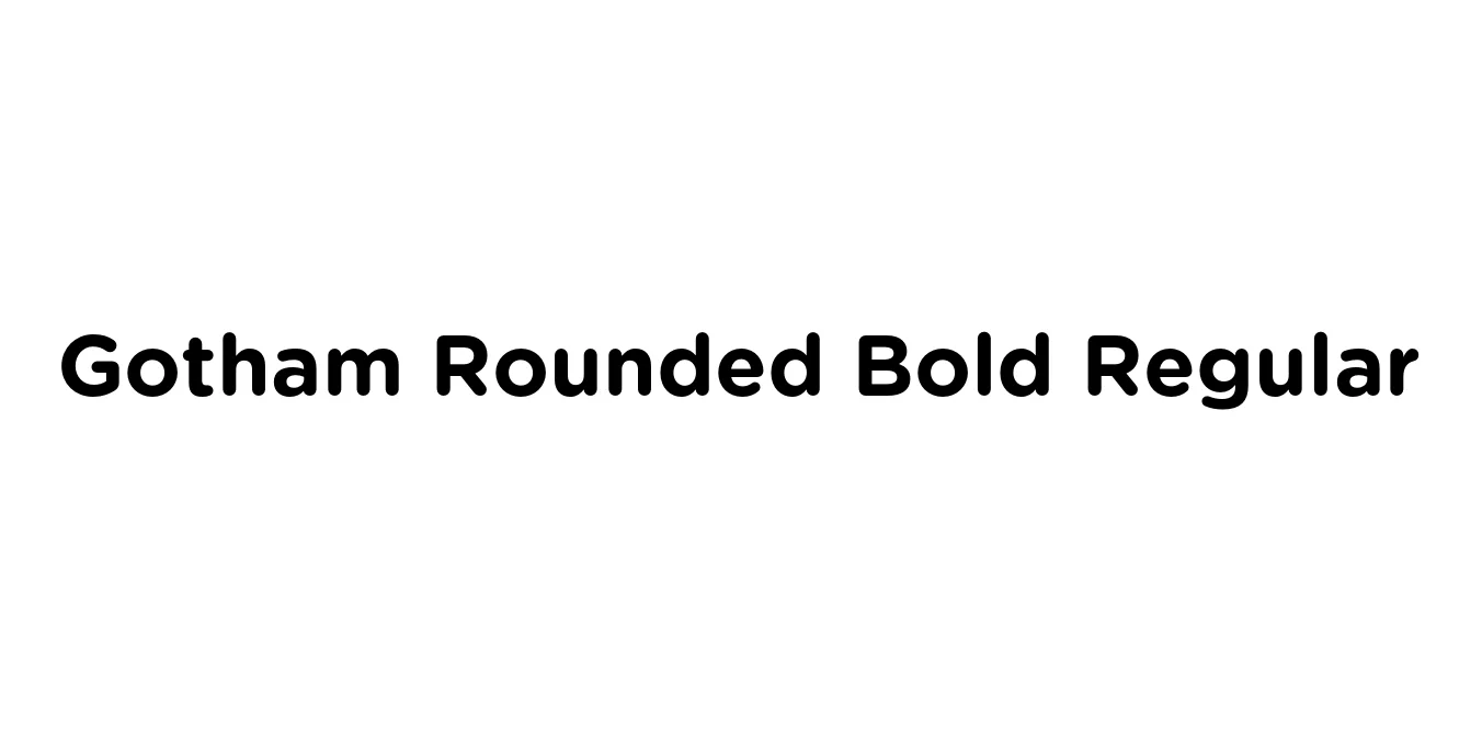
| Font Name | Gotham Rounded Bold |
| Style | Regular |
| Category | Geometric Sans Serif |
| Designer | Tobias Frere-Jones |
| Copyright | Copyright (C) 2006, 2007 Hoefler & Frere-Jones. http://www.typography.com |
| License | Free for Personal Use / Commercial License Required |
| Total Character | 344 |
| Recommended Line Height | 1.2 |
| Ascent | 960 |
| Descent | 240 |
| Units Per em | 1000 |
| Total Vertical Range | 1200 |
| Max Advance Width | 1240 |
| Max Advance Height | N/A |
| Underline Position | -75 |
| Similar Fonts | Proxima Soft, Nunito, Montserrat Alternates, Nexa Rounded |
Gotham Rounded Bold Regular Font Details : Font Free Download
Gotham Rounded Bold Regular is a direct descendant of the iconic Gotham typeface, which was originally inspired by the mid-century architectural signage found throughout New York City. Developed by Tobias Frere-Jones, this specific iteration retains the geometric foundation and structural integrity of the original while softening its terminals and edges to create a friendly, approachable, and contemporary aesthetic.
The Bold Regular weight is particularly effective for high-impact display use, striking a perfect balance between authority and visual warmth. It has become a staple in modern digital design and corporate branding, favored for its exceptional legibility and the unique, technical-yet-human personality it lends to both web and print environments.
Gotham Rounded Bold Regular Best Uses
Ideal for creating approachable and tech-forward brand identities.
Excellent for high-visibility headers and call-to-action buttons on mobile apps.
Grabs attention in headlines while maintaining a soft, non-aggressive tone.
Works well for modern consumer goods that require a clean, friendly look.
Gotham Rounded Bold Regular Glyphs
