Gotham Rounded Book Italic
Designed by Tobias Frere-Jones
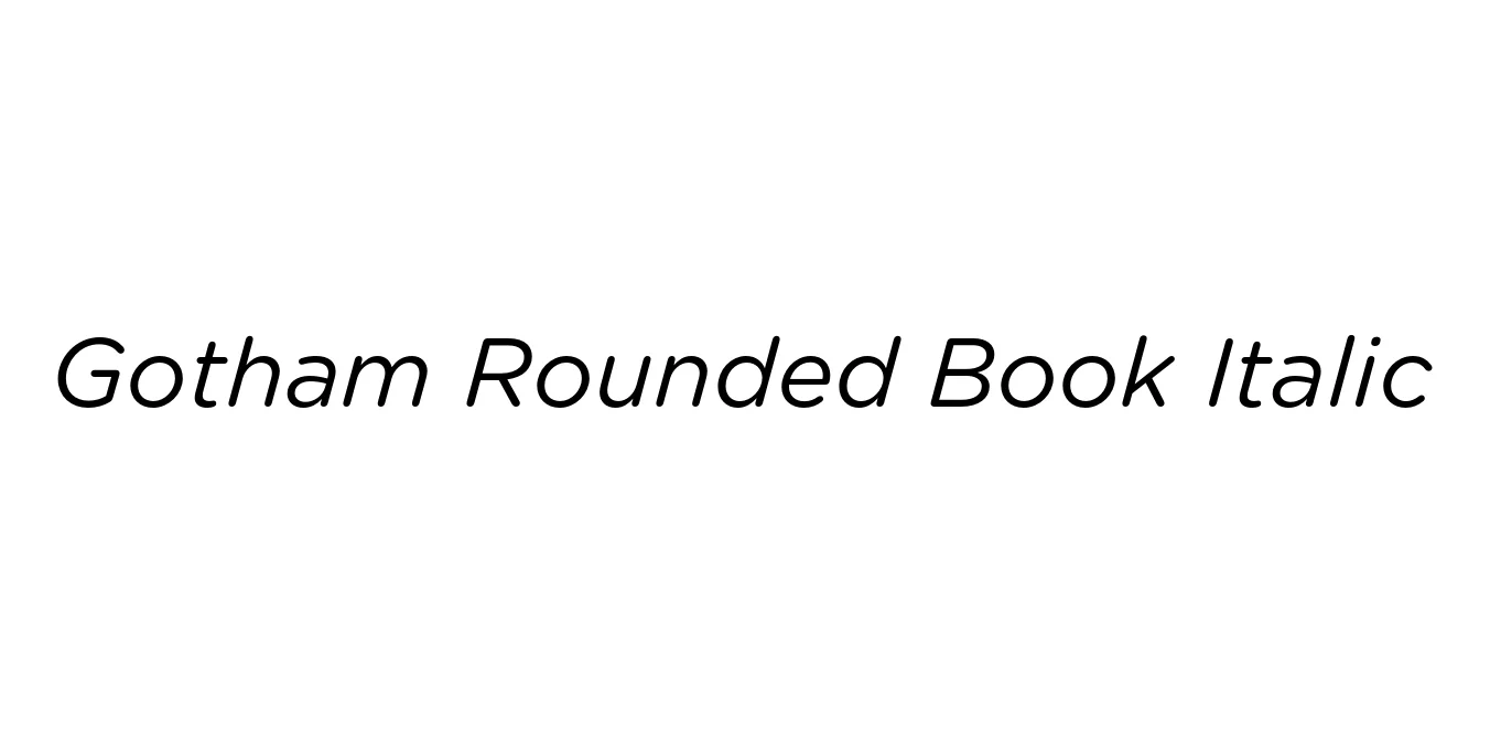
| Font Name | Gotham Rounded Book |
| Style | Italic |
| Category | Geometric Sans-Serif |
| Designer | Tobias Frere-Jones |
| Copyright | Copyright (C) 2006, 2007 Hoefler & Frere-Jones. http://www.typography.com |
| License | Commercial (License Required) |
| Total Character | 344 |
| Recommended Line Height | 1.2 |
| Ascent | 960 |
| Descent | 240 |
| Units Per em | 1000 |
| Total Vertical Range | 1200 |
| Max Advance Width | 1226 |
| Max Advance Height | N/A |
| Underline Position | -75 |
| Similar Fonts | Proxima Soft, Nunito, Montserrat, Museo Sans, Arial Rounded |
Gotham Rounded Book Italic Font Details : Font Free Download
Gotham Rounded Book Italic is a refined evolution of the original Gotham typeface, which was inspired by the architectural and signage lettering of mid-century New York City. Designed by Tobias Frere-Jones, this specific iteration takes the geometric integrity of the parent family and softens the terminals to create a more approachable and friendly aesthetic. It manages to maintain the authoritative, honest voice of Gotham while introducing a contemporary, digital-friendly warmth.
The Book Italic weight is particularly noted for its graceful slant and balanced proportions, making it highly effective for subtle emphasis in long-form text or as a sophisticated header. Because it moves away from the rigid industrial feel of the standard Gotham, it has become a staple in modern branding, mobile app interfaces, and corporate identities that aim to appear technical yet human-centric.
Gotham Rounded Book Italic Best Uses
Ideal for startups and tech companies seeking a friendly yet professional brand image.
Perfect for mobile applications and web interfaces where soft edges improve user experience.
Excellent for providing subtle emphasis and stylistic contrast in body copy.
Highly effective for catchy sub-headlines and marketing collateral.
Gotham Rounded Book Italic Glyphs
