Gotham Rounded Medium Regular
Designed by Tobias Frere-Jones
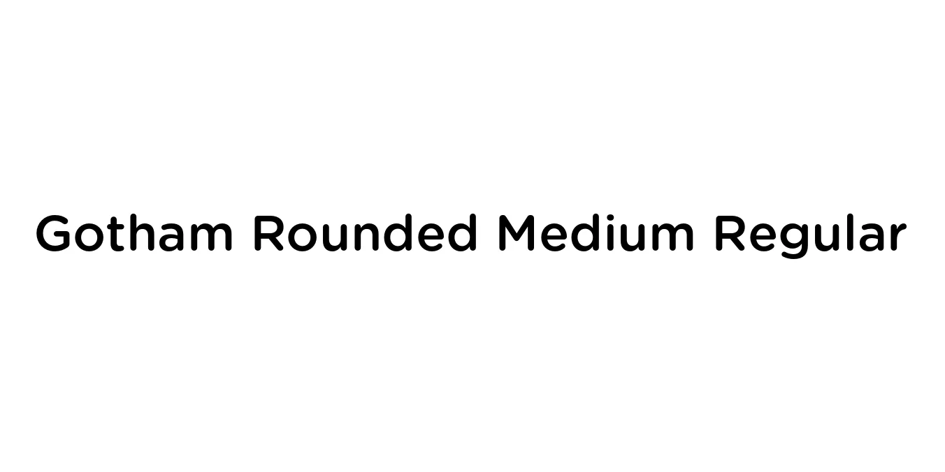
| Font Name | Gotham Rounded Medium |
| Style | Regular |
| Category | Sans Serif |
| Designer | Tobias Frere-Jones |
| Copyright | Copyright (C) 2006, 2007 Hoefler & Frere-Jones. http://www.typography.com |
| License | Commercial License Required |
| Total Character | 344 |
| Recommended Line Height | 1.2 |
| Ascent | 960 |
| Descent | 240 |
| Units Per em | 1000 |
| Total Vertical Range | 1200 |
| Max Advance Width | 1228 |
| Max Advance Height | N/A |
| Underline Position | -75 |
| Similar Fonts | Proxima Soft, Montserrat, Nunito, Museo Sans |
Gotham Rounded Medium Regular Font Details : Font Free Download
Gotham Rounded Medium Regular is a technical extension of the iconic Gotham typeface family, which was originally inspired by the geometric lettering found on New York City's architectural signage. Designed by Tobias Frere-Jones, this specific iteration softens the rigid, honest geometry of the original Gotham by introducing smooth, circular terminals. This results in a typeface that feels both engineered and approachable, maintaining its architectural roots while adding a friendly, contemporary warmth.
The Medium weight offers a perfect balance of substance and clarity, making it exceptionally versatile for modern design environments. It retains the wide apertures and generous letterforms of the Gotham family, ensuring high legibility in both digital and print formats. It is frequently utilized by brands that want to communicate a sense of technical precision and trustworthiness without appearing overly formal or cold.
Gotham Rounded Medium Regular Best Uses
Creating a friendly yet professional corporate identity.
Clean headlines and interface elements for modern websites.
User-friendly navigation menus and touch-friendly buttons.
Print and digital ads requiring a clear and approachable tone.
Gotham Rounded Medium Regular Glyphs
