Classico Bold
Humanist Sans-SerifDesigned by Hermann Zapf

Designed by Frederic W. Goudy
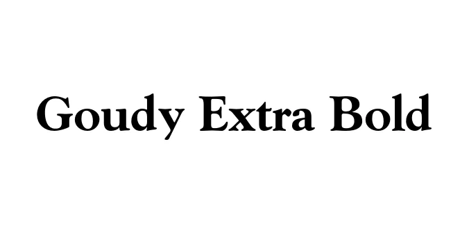
| Font Name | Goudy Extra |
| Style | Bold |
| Category | Serif |
| Designer | Frederic W. Goudy |
| Copyright | Copyright (c) 1988 Adobe Systems Incorporated. All Rights Reserved. |
| License | Free for Personal Use |
| Total Character | 228 |
| Recommended Line Height | 1.14 |
| Ascent | 924 |
| Descent | 218 |
| Units Per em | 1000 |
| Total Vertical Range | 1142 |
| Max Advance Width | 1000 |
| Max Advance Height | N/A |
| Underline Position | -112 |
| Similar Fonts | Goudy Old Style, Cooper Black, Cheltenham Bold, GFS Solomos |
Goudy Extra Bold, frequently associated with the 'Goudy Heavy Face' family, was designed by the legendary American typographer Frederic W. Goudy in the early 1920s. As a heavy-duty extension of the Goudy Old Style family, this typeface was engineered to satisfy the demands of the burgeoning advertising industry which required a font that combined classical elegance with high-impact visibility. It retains the signature calligraphic flourishes of Goudy’s work, such as the upturned ear on the 'g' and the diamond-shaped tittles on the 'i' and 'j'.
This typeface is a masterclass in Old Style serif construction pushed to its weight limit. Despite its massive strokes, it preserves a warmth and humanistic quality that modern geometric slab serifs often lack. Throughout the mid-20th century, Goudy Extra Bold became a staple for magazine publishers and retailers, offering a sense of authority and tradition that remains highly effective in contemporary digital and print environments for titles that need to command attention.
Commanding attention in magazine and newspaper editorial layouts.
Creating strong, traditional corporate identities and logos.
Effective for high-impact print ads and promotional flyers.
Providing a sense of weight and classic literature aesthetics.

Designed by Hermann Zapf
Designed by Vunira Design

Designed by Robin Nicholas

Designed by James H. Ultsh