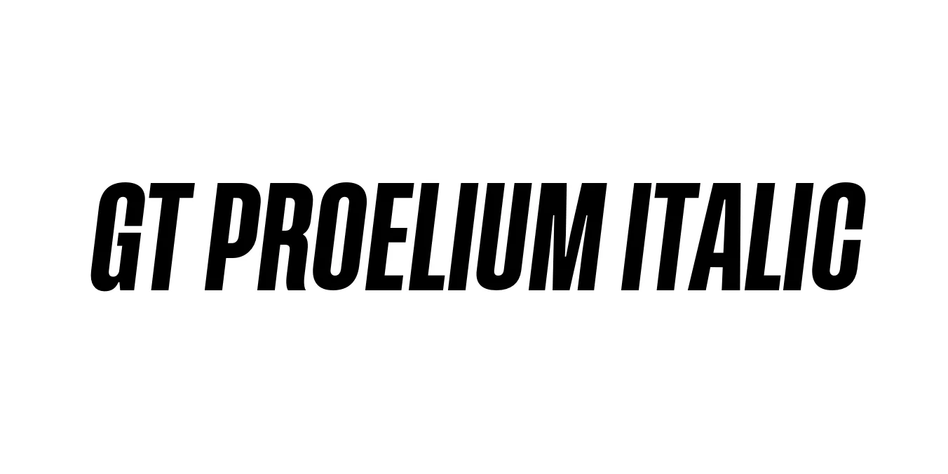
GT Proelium Italic
Designed by Valtin Kamm, Reto Moser (Grilli Type)
| Font Name | GT Proelium Italic |
| Style | Italic |
| Category | Serif |
| Designer | Valtin Kamm, Reto Moser (Grilli Type) |
| Copyright | Copyright © 2024 by GigaType. All rights reserved. |
| License | Free for Personal Use |
| Total Character | 332 |
| Recommended Line Height | 1.4 |
| Ascent | 2525 |
| Descent | 352 |
| Units Per em | 2048 |
| Total Vertical Range | 2877 |
| Max Advance Width | 2344 |
| Max Advance Height | N/A |
| Underline Position | 0 |
| Similar Fonts | GT Sectra, Noe Display, Tiempos Headline |
GT Proelium Italic Font Details : Font Free Download
GT Proelium Italic is a high-contrast serif typeface that draws its inspiration from the chiseled precision of ancient Roman inscriptions, reimagined through a modern, aggressive lens. Designed by the Swiss foundry Grilli Type, the typeface family was developed to embody a sense of competition and movement. The name 'Proelium,' meaning 'battle' in Latin, is perfectly represented in its sharp, blade-like serifs and the dynamic, forward-leaning energy of the italic weight.
The Italic variant is particularly striking, featuring a steeper angle and more pronounced calligraphic influences than standard italics. This results in a typeface that feels both historical and futuristic, making it an ideal choice for high-end editorial layouts, luxury branding, and sports-related design projects. Its technical construction ensures high legibility at large scales while maintaining an intricate, decorative quality that demands attention.
GT Proelium Italic Best Uses
Ideal for team logos and athletic marketing due to its aggressive, sharp aesthetic.
Excellent for high-impact magazine headlines and feature articles.
Conveys a sense of sharp elegance suitable for luxury brand identities.
Works well for large-scale typography where the sharp details can be appreciated.
GT Proelium Italic Glyphs

Download Font
Package Size: 48.9 KB
Available Formats: .OTF