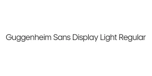
Guggenheim Sans Display Black Regular
Sans Serif / DisplayDesigned by Hoefler & Co. (Jonathan Hoefler)

Designed by Jonathan Hoefler (Hoefler & Co.)
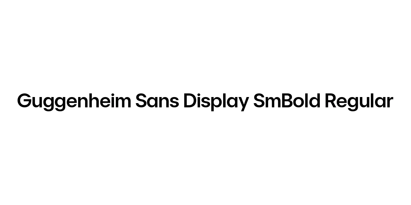
| Font Name | Guggenheim Sans Display SmBold |
| Style | Regular |
| Category | Sans Serif |
| Designer | Jonathan Hoefler (Hoefler & Co.) |
| Copyright | Copyright 2022 The Inter Project Authors (https://github.com/rsms/inter-tight) |
| License | Free for Personal Use |
| Total Character | 363 |
| Recommended Line Height | 1.42 |
| Ascent | 2263 |
| Descent | 654 |
| Units Per em | 2048 |
| Total Vertical Range | 2917 |
| Max Advance Width | 2171 |
| Max Advance Height | N/A |
| Underline Position | -323 |
| Similar Fonts | Gotham, Nobel, Futura, ITC Avant Garde Gothic |
Commissioned in the late 1990s for the Solomon R. Guggenheim Museum by Hoefler & Co., Guggenheim Sans (originally titled 'Guggenheim') was designed to capture the modern, geometric spirit of the museum's iconic architecture. The typeface draws inspiration from the minimalist aesthetics of mid-century modernism, reflecting both the building's circular motifs and its clean, structural lines to create a timeless visual identity.
The SmBold Regular weight of the Display subfamily is specifically optimized for high-impact headlines and signage. Its proportions are refined to maintain legibility at large scales while projecting an air of institutional authority and contemporary sophistication. This font has since become a cornerstone of the museum's branding, bridging the gap between historical art movements and digital-era design requirements.
Creating cohesive identity systems for galleries and art institutions.
Striking headlines in high-fashion magazines or art digital publications.
Large-scale lettering for wall text and environmental wayfinding.
Minimalist labels for premium retail products and high-end brands.

Package Size: 157.0 KB
Available Formats: .TTF, .WOFF, .WOFF2
Designed by Hoefler & Co. (Jonathan Hoefler)
Designed by Hoefler & Co.

Designed by Hoefler & Co.
Designed by Hoefler & Co.