Guggenheim Sans Display Black Regular
Sans Serif / DisplayDesigned by Hoefler & Co. (Jonathan Hoefler)

Designed by Jonathan Hoefler (Hoefler & Co.)
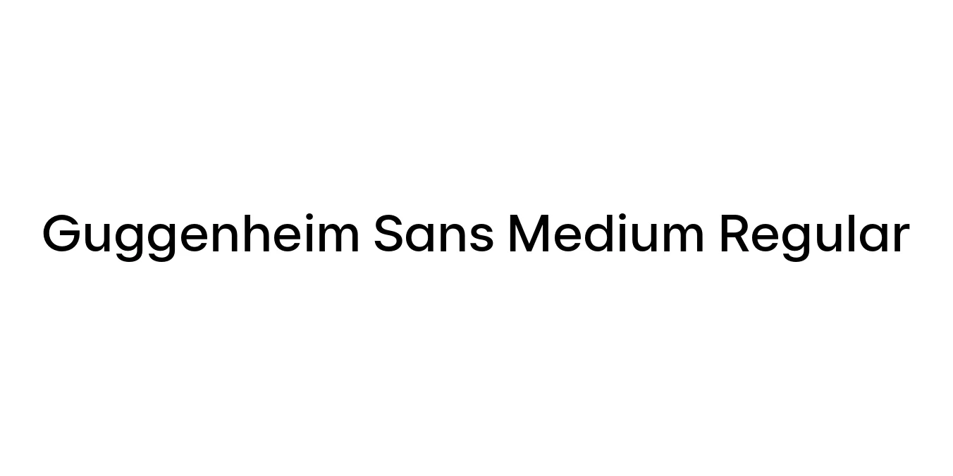
| Font Name | Guggenheim Sans Medium |
| Style | Regular |
| Category | Geometric Sans-Serif |
| Designer | Jonathan Hoefler (Hoefler & Co.) |
| Copyright | Copyright 2022 The Inter Project Authors (https://github.com/rsms/inter-tight) |
| License | Free for Personal Use |
| Total Character | 363 |
| Recommended Line Height | 1.42 |
| Ascent | 2263 |
| Descent | 654 |
| Units Per em | 2048 |
| Total Vertical Range | 2917 |
| Max Advance Width | 2268 |
| Max Advance Height | N/A |
| Underline Position | -330 |
| Similar Fonts | Verlag, Futura, Gotham, Montserrat, Avenir |
Guggenheim Sans is a sophisticated geometric sans-serif typeface originally developed to define the visual identity of the Solomon R. Guggenheim Museum. The font is an evolution of the Verlag family, which was inspired by the modernist aesthetic of the 1930s and tailored specifically for the museum's publications and signage. Its design reflects the architectural precision and avant-garde spirit associated with the museum's global brand.
The Medium Regular weight provides a perfectly balanced stroke width that offers high legibility without losing the font's characteristic sharp, geometric forms. Characterized by its low-contrast strokes and circular letterforms, Guggenheim Sans Medium Regular is frequently used in high-end editorial layouts and institutional branding to convey a sense of authority, modernism, and clarity across both digital and print platforms.
Creating a professional and institutional identity for organizations.
Headlines and subheadings in magazines or art catalogs.
Clear and legible signage for galleries and public spaces.
Clean, minimalist user interfaces and hero section typography.

Designed by Hoefler & Co. (Jonathan Hoefler)
Designed by Hoefler & Co.

Designed by Hoefler & Co.

Designed by Hoefler & Co.