Harry Medium
Designed by Marty Goldstein
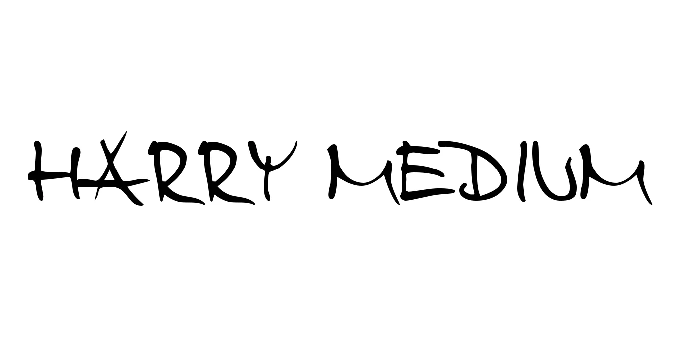
| Font Name | Harry |
| Style | Medium |
| Category | Sans Serif |
| Designer | Marty Goldstein |
| Copyright | Generated by Fontographer 4.04 und den Trger«s Harald aus Marktredwitz, Oberfranken (in Bayern) o.w. |
| License | Free for Personal Use |
| Total Character | 186 |
| Recommended Line Height | 2.75 |
| Ascent | 1908 |
| Descent | 839 |
| Units Per em | 1000 |
| Total Vertical Range | 2747 |
| Max Advance Width | 2524 |
| Max Advance Height | N/A |
| Underline Position | -123 |
| Similar Fonts | Bauhaus, Blippo, ITC Ronda, Futura |
Harry Medium Font Details : Font Free Download
Harry Medium was originally designed in 1966 by Marty Goldstein and C.B. Smith for the Visual Graphics Corporation (VGC). This typeface represents a significant moment in typographic history, blending the rigid geometric foundations of mid-century Swiss design with the softening, rounded influences that would come to define the late 1960s and early 1970s aesthetics. Its clean lines and distinctive personality made it an instant favorite for modern advertising and broadcast media.
The Harry Medium weight specifically strikes a versatile balance, offering enough presence for display use while remaining legible for brief body copy. Over the decades, it has seen a resurgence in digital media, often employed to evoke a sophisticated retro-modern feel. Its unique construction—neither strictly a grotesque nor a pure geometric sans—gives it a timeless quality that works well in both high-quality print and modern digital environments.
Harry Medium Best Uses
Ideal for vintage-inspired marketing campaigns and eye-catching posters.
Perfect for creating memorable brand identities with a mid-century modern touch.
Well-suited for large-scale editorial titles and bold website headers.
Often used for title sequences to establish a specific historical or retro-futuristic mood.
Harry Medium Glyphs
