Herkules Shadow
Designed by Hermann Ihlenburg
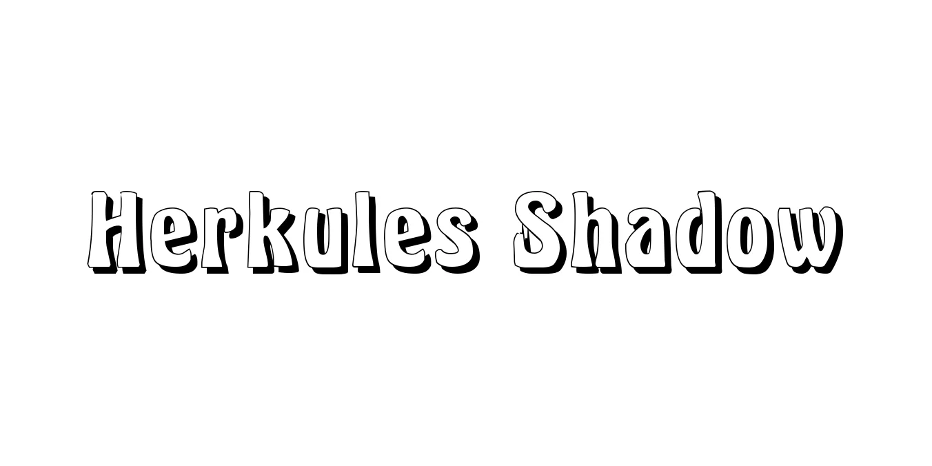
| Font Name | Herkules |
| Style | Shadow |
| Category | Display / Decorative |
| Designer | Hermann Ihlenburg |
| Copyright | Copyright (c) Typographer Mediengestaltung, 2004. All rights reserved. Digitized by Dieter Steffmann, Kreuztal |
| License | Free for Personal Use |
| Total Character | 245 |
| Recommended Line Height | 1.19 |
| Ascent | 880 |
| Descent | 313 |
| Units Per em | 1000 |
| Total Vertical Range | 1193 |
| Max Advance Width | 1466 |
| Max Advance Height | N/A |
| Underline Position | -173 |
| Similar Fonts | Herkules, Thorowgood, Victorian Display, Goudy Handtooled |
Herkules Shadow Font Details : Font Free Download
Herkules Shadow is a classic display typeface that traces its origins back to the late 19th century, specifically designed by the prolific German-American type designer Hermann Ihlenburg in 1899. This font is a quintessential example of Victorian-era typography, characterized by its high-contrast letterforms, ornate serifs, and a distinctive drop shadow that provides a bold, three-dimensional architectural quality. Originally released by the American Type Founders (ATF), it was created to capture the grandeur and industrial elegance of the Gilded Age.
In contemporary design, Herkules Shadow remains a powerful choice for display applications where a sense of history and authority is required. The typeface is most effective at larger scales, which allow the intricate shadow detailing and sharp, decorative serifs to be fully appreciated. It is frequently employed in vintage branding, period-accurate film titling, and sophisticated poster design, bridging the gap between traditional metal type aesthetics and modern digital graphic needs.
Herkules Shadow Best Uses
Ideal for bold, attention-grabbing titles that require a historical or authoritative feel.
Excellent for theatrical, event, or promotional posters with a classic aesthetic.
Perfect for logo designs and packaging aiming for a 19th-century luxury look.
Herkules Shadow Glyphs
