Hi. Tall Oblique
Designed by Gilar Sellu (Handletter)
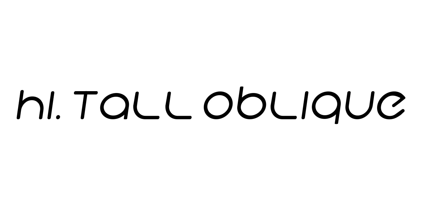
| Font Name | Hi. |
| Style | Tall Oblique |
| Category | Display Sans Serif |
| Designer | Gilar Sellu (Handletter) |
| Copyright | Copyright (c) 2015, Mew Too/Cannot Into Space Fonts, All Rights Reserved. |
| License | Free for Personal Use |
| Total Character | 254 |
| Recommended Line Height | 1 |
| Ascent | 813 |
| Descent | 184 |
| Units Per em | 1000 |
| Total Vertical Range | 997 |
| Max Advance Width | 1406 |
| Max Advance Height | N/A |
| Underline Position | -125 |
| Similar Fonts | Bebas Neue Italic, Steelfish, Tungsten, Impact Italic |
Hi. Tall Oblique Font Details : Font Free Download
Hi. Tall Oblique is a contemporary display typeface characterized by its extremely condensed proportions and sharp, slanted stance. Designed to command attention in narrow spaces, this font blends minimalist aesthetics with a bold, vertical presence. Its clean lines and precise angles make it an ideal choice for modern designers looking to add a touch of sophistication and movement to their typographic layouts without sacrificing readability.
The history of this typeface stems from the trend of ultra-tall sans-serifs that prioritize verticality over width to maximize impact in digital and print media. Hi. Tall Oblique specifically addresses the need for a dynamic, italicized version of condensed fonts, allowing for high-impact headlines that feel both energetic and refined. Since its release, it has become a popular asset for digital creators, photographers, and brands seeking a distinct, fashion-forward visual identity.
Hi. Tall Oblique Best Uses
Perfect for high-fashion magazine headers and vertical layouts.
Great for eye-catching Instagram stories and quote overlays.
Ideal for minimalist logos that require a sleek, vertical silhouette.
Highly effective for bold, condensed event titles and film posters.
Hi. Tall Oblique Glyphs
