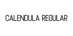
Lomax Regular
Sans SerifDesigned by Alan Meeks
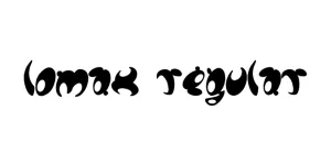
Designed by Ray Larabie (Typodermic Fonts)
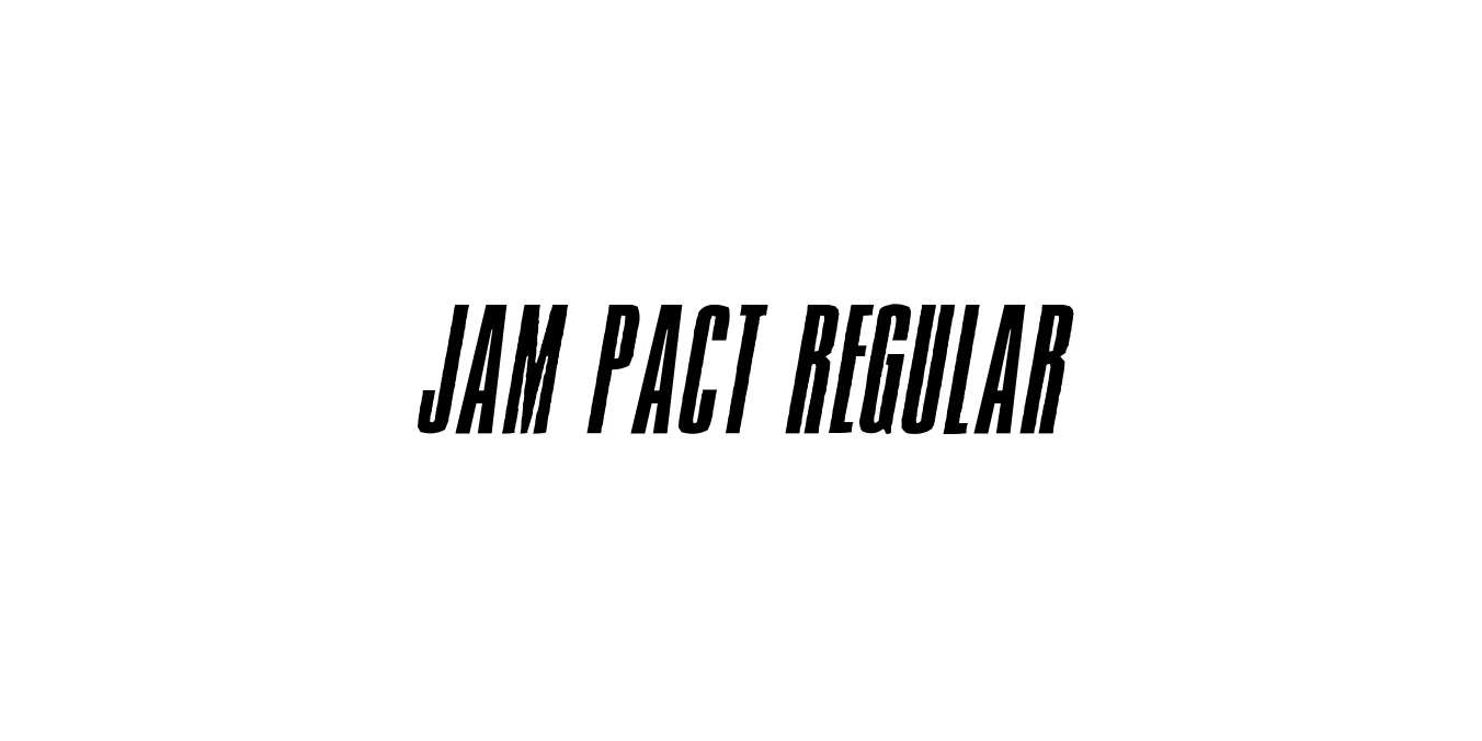
| Font Name | Jam Pact |
| Style | Regular |
| Category | Display Sans Serif |
| Designer | Ray Larabie (Typodermic Fonts) |
| Copyright | 2004 Vic Fieger, Xaviera Comics |
| License | Free for Personal Use |
| Total Character | 252 |
| Recommended Line Height | 1.12 |
| Ascent | 1854 |
| Descent | 434 |
| Units Per em | 2048 |
| Total Vertical Range | 2288 |
| Max Advance Width | 1443 |
| Max Advance Height | N/A |
| Underline Position | -164 |
| Similar Fonts | Impact, Compacta, Haettenschweiler, Titling Gothic |
Jam Pact Regular is a high-impact display typeface designed by Ray Larabie under the Typodermic Fonts foundry. Drawing inspiration from the dense, heavy sans-serifs used in mid-century advertising and cinematic titling, this font is engineered to fill space efficiently while maintaining maximum visual weight. Its construction features tight apertures and a solid, blocky structure that demands immediate attention in any graphic layout.
Over the years, Jam Pact has become a go-to choice for designers needing a font that balances an industrial, retro feel with modern digital clarity. It is particularly effective for headlines and posters where horizontal space is limited but impact is paramount. The typeface's aggressive yet legible forms make it a versatile tool for sports branding, action-oriented movie posters, and bold social media graphics.
Perfect for high-impact titles that need to grab immediate attention.
Ideal for large-scale prints and promotional materials requiring a loud voice.
Works exceptionally well for aggressive and energetic team logos or apparel.
Excellent for cinematic opening credits and action-themed digital graphics.

Designed by Alan Meeks
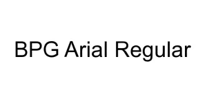
Designed by Besarion Paata Gugushvili (BPG InfoTech)
Designed by Dan Cassaro
Designed by Anis Iday