Jerry Regular
Designed by Steve Jackaman
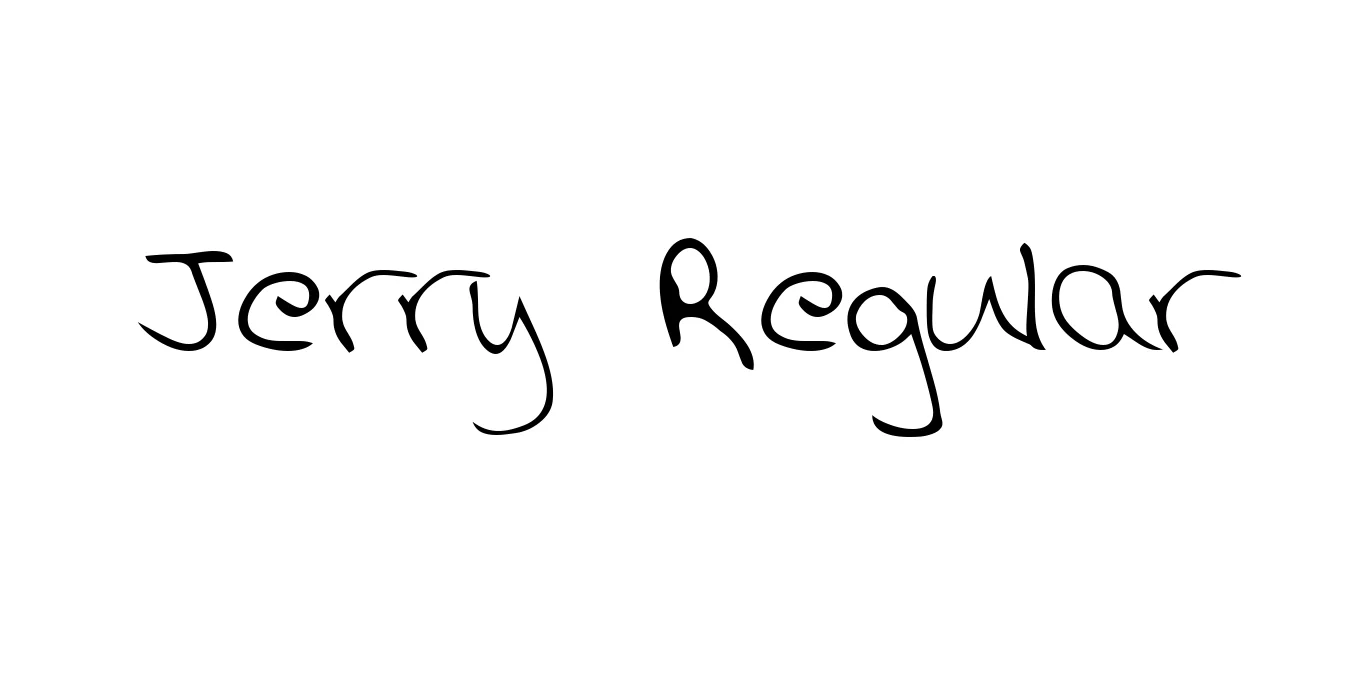
| Font Name | Jerry |
| Style | Regular |
| Category | Slab Serif |
| Designer | Steve Jackaman |
| Copyright | Generated by Metamorphosis Professional 2.05 |
| License | Free for Personal Use |
| Total Character | 108 |
| Recommended Line Height | 1.55 |
| Ascent | 1007 |
| Descent | 539 |
| Units Per em | 1000 |
| Total Vertical Range | 1546 |
| Max Advance Width | 975 |
| Max Advance Height | N/A |
| Underline Position | -232 |
| Similar Fonts | Clarendon, Rockwell, Memphis, Serifa |
Jerry Regular Font Details : Font Free Download
Jerry Regular is a distinctive slab serif typeface that strikes a balance between industrial rigidity and approachable character. Originally designed to capture the essence of mid-20th-century display lettering, it features bold, blocky serifs and a consistent stroke weight that ensures high visibility. The font's sturdy structure makes it an excellent choice for designers looking to convey strength and reliability while maintaining a touch of friendly warmth.
The evolution of Jerry Regular has seen it transition from niche print advertisements to modern digital interfaces. Its clean lines and generous spacing allow for excellent legibility even at smaller sizes, though it truly shines in large-scale applications like billboards and storefront signage. As a versatile member of the slab serif family, it bridges the gap between classic editorial aesthetics and contemporary graphic design trends.
Jerry Regular Best Uses
Perfect for creating strong, memorable logos and corporate identities.
Ideal for impactful headlines in print and digital marketing materials.
Great for hero sections and prominent call-to-action buttons.
Works well for large-format prints where readability from a distance is key.
Jerry Regular Glyphs

Download Font
Package Size: 27.3 KB
Available Formats: .TTF