Josefin Sans SemiBold
Designed by Santiago Orozco
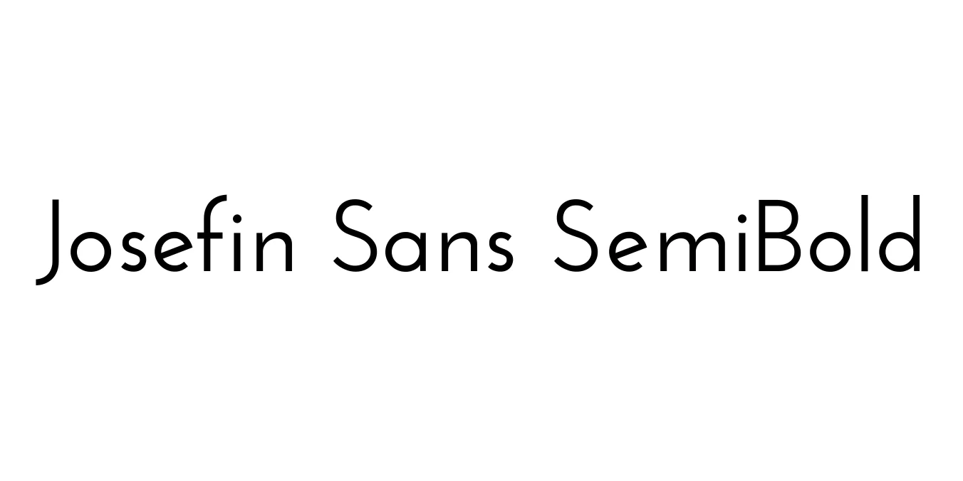
| Font Name | Josefin Sans |
| Style | SemiBold |
| Category | Geometric Sans-Serif |
| Designer | Santiago Orozco |
| Copyright | Copyright (c) 2010 by Typemade. All rights reserved. |
| License | SIL Open Font License (Free for Personal & Commercial Use) |
| Total Character | 201 |
| Recommended Line Height | 1.2 |
| Ascent | 947 |
| Descent | 250 |
| Units Per em | 1000 |
| Total Vertical Range | 1197 |
| Max Advance Width | 1276 |
| Max Advance Height | N/A |
| Underline Position | -75 |
| Similar Fonts | Futura, Kabel, Brandon Grotesque |
Josefin Sans SemiBold Font Details : Font Free Download
Josefin Sans SemiBold was meticulously crafted by Santiago Orozco, who drew inspiration from the geometric sans-serif typefaces popular in the 1920s. This specific weight offers a sturdy and confident typographic presence, blending a vintage aesthetic with modern cleanliness. It is characterized by its sharp angles and circular forms, which provide a rhythmic and balanced look suitable for both high-end digital interfaces and premium print materials.
One of the most distinctive features of this typeface is its x-height, which is set to exactly half of the cap height, a design choice that emphasizes its geometric roots. Since its release via Google Fonts, Josefin Sans has evolved into a versatile family used globally for projects requiring an elegant, Art Deco-inspired vibe. The SemiBold iteration is particularly favored for its ability to maintain legibility while making a bold statement in professional branding and web design.
Josefin Sans SemiBold Best Uses
Ideal for bold, attention-grabbing titles and section headers.
Perfect for creating minimalist, luxury, and modern brand identities.
High impact for Instagram graphics, Pinterest pins, and digital ads.
Excellent for editorial layouts, posters, and sophisticated business cards.
Josefin Sans SemiBold Glyphs
