EtruscoNow Bold
Sans-serif / GrotesqueDesigned by Cosimo Lorenzo Pancini, Mario Perbene

Designed by Patrick Griffin
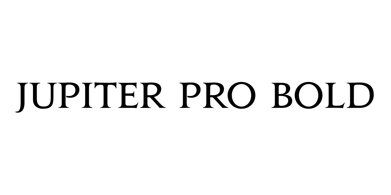
| Font Name | Jupiter Pro |
| Style | Bold |
| Category | Serif |
| Designer | Patrick Griffin |
| Copyright | Copyright © 2007 Canada Type. All rights reserved. |
| License | Commercial License Required |
| Total Character | 848 |
| Recommended Line Height | 1.58 |
| Ascent | 1184 |
| Descent | 396 |
| Units Per em | 1000 |
| Total Vertical Range | 1580 |
| Max Advance Width | 2047 |
| Max Advance Height | N/A |
| Underline Position | -75 |
| Similar Fonts | Trajan Pro, Cinzel, Optimus Princeps, Goudy Old Style |
Jupiter Pro Bold is a distinguished serif typeface designed by Patrick Griffin and released through the Canada Type foundry. It is heavily inspired by the classical Roman monumental capitals found on the Trajan Column in Rome, capturing a sense of historical grandeur and timeless elegance. The Bold weight specifically enhances the presence of these traditional forms, making them more suitable for modern display applications where a strong, authoritative voice is required.
The font features sharp, well-defined serifs and a balanced contrast in stroke weight that exudes sophistication. Unlike many other Roman-style faces that are strictly all-caps, Jupiter Pro offers a refined set of characters that bridge the gap between ancient inscription and contemporary typography. It is widely recognized for its use in high-end publishing, luxury branding, and cinematic titles, providing a touch of intellectual prestige to any design project.
Perfect for high-end fashion, jewelry, and corporate identities that require a sense of heritage.
Ideal for movie posters and film credits that need a classical, epic feel.
Excellent for magazine mastheads, book covers, and sophisticated headlines.

Designed by Cosimo Lorenzo Pancini, Mario Perbene
Designed by Thomas Jockin

Designed by SUSE Brand Team

Designed by Thomas Jockin, Nadine Chahine