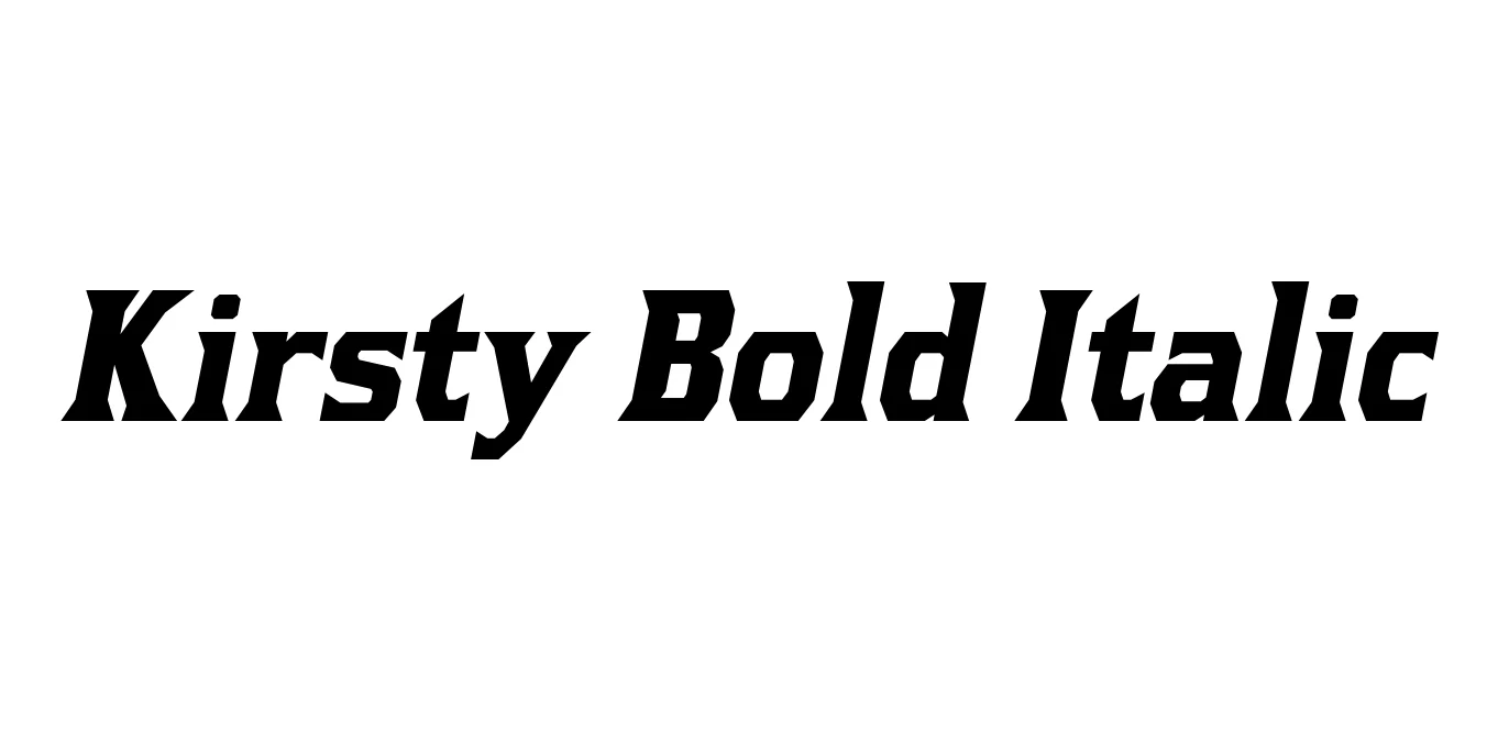
Kirsty Bold Italic
Designed by Ray Larabie
| Font Name | Kirsty |
| Style | Bold Italic |
| Category | Display Serif |
| Designer | Ray Larabie |
| Copyright | © 2000-2024 Typodermic Fonts Inc. |
| License | Free for Personal Use |
| Total Character | 864 |
| Recommended Line Height | 1.2 |
| Ascent | 968 |
| Descent | 232 |
| Units Per em | 1000 |
| Total Vertical Range | 1200 |
| Max Advance Width | 1053 |
| Max Advance Height | N/A |
| Underline Position | -80 |
| Similar Fonts | Albertus, Flareserif 821, Fritz Quadrata |
Kirsty Bold Italic Font Details : Font Free Download
Kirsty Bold Italic is a striking display typeface designed by Ray Larabie under the Typodermic Fonts label. It draws significant inspiration from the unique, chiseled lettering seen in the logo for the 1960s television series The Prisoner, which was originally based on the classic typeface Albertus. This bold italic weight adds a sense of urgency and dynamic motion to the design, characterized by its sharp angles and flared serifs that bridge the gap between ancient stone carving and mid-century modernism.
The typeface is known for its high-contrast strokes and distinctive letterforms, particularly the idiosyncratic curves and sharp terminals. While the base font conveys a sense of timeless authority, the Bold Italic variant is specifically crafted for high-impact visual communication. It is frequently employed in creative media projects where a blend of retro-futurism and classical elegance is required to capture the viewer's attention instantly.
Kirsty Bold Italic Best Uses
Bold and slanted style makes it perfect for eye-catching magazine headers.
Distinctive flared serifs provide a unique identity for corporate and creative brand marks.
Captures a vintage cinematic feel suitable for drama, thriller, or historical titles.
Works exceptionally well for fantasy or historical RPG game interfaces.
Kirsty Bold Italic Glyphs
