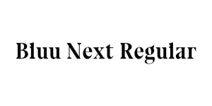
Hollow Space Regular
Display / Sci-FiDesigned by Youssef Habchi
Designed by Fontworks Inc.
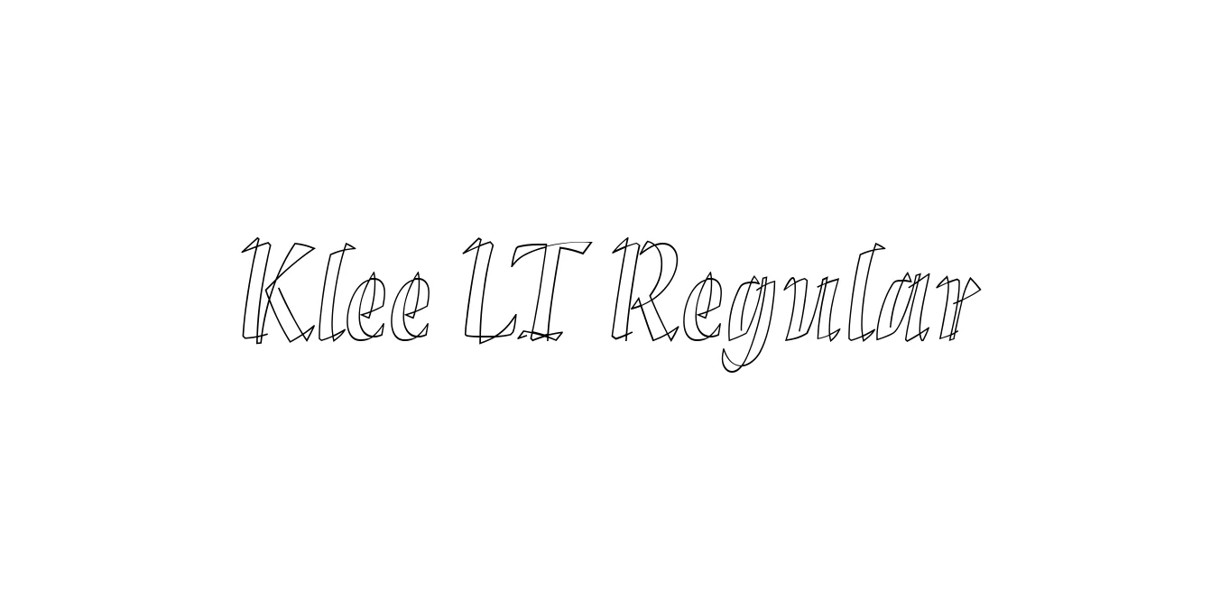
| Font Name | Klee LT |
| Style | Regular |
| Category | Humanist Sans-Serif Hybrid |
| Designer | Fontworks Inc. |
| Copyright | Part of this software is copyrighted (c) 2003 Linotype Library GmbH, www.linotype.com. All rights reserved. This software may not be reproduced, used, displayed, modified or transferred without the express written approval of Linotype Library GmbH. Klee is a trademark of International Typeface Corporation. This typeface is original artwork of Timothy Donaldson. The design may protected in certain jurisdictions. |
| License | Commercial License Required |
| Total Character | 249 |
| Recommended Line Height | 1.19 |
| Ascent | 926 |
| Descent | 262 |
| Units Per em | 1000 |
| Total Vertical Range | 1188 |
| Max Advance Width | 1091 |
| Max Advance Height | N/A |
| Underline Position | -134 |
| Similar Fonts | Klee One, Kaiu, MS Mincho, Hiragino Maru Gothic |
Klee LT Regular is a sophisticated typeface developed by the Japanese foundry Fontworks, originally conceived to bridge the gap between traditional calligraphy and modern digital typesetting. Designed with the aesthetic of pencil-written characters in mind, it was created to provide a warm, human touch to Japanese educational materials and textbooks. While it has its roots in the Klee family used extensively in Asian markets, the LT version—distributed through the Linotype library—standardizes the Latin glyphs for global professional use, maintaining a balance between technical precision and organic fluidity.
Technically, Klee LT Regular is characterized by its humanist letterforms and a generous x-height that facilitates exceptional legibility at small point sizes. The strokes mimic the natural pressure of a pen, featuring slightly tapered terminals and soft curves that avoid the mechanical coldness of standard sans-serifs. Its visual weight is consistent and rhythmic, with open counters that prevent ink-clogging in print. This delicate balance of low contrast and high readability makes it an expert choice for long-form body text where a sense of intimacy and scholarly clarity is required.
Ideal for long-form reading in journals and digital books.
Excellent for scholarly articles requiring a clean yet approachable tone.
Adds a warm, organic feel to minimalist mobile interfaces.
Works well for lifestyle brands seeking a sophisticated, handwritten aesthetic.

Package Size: 177.2 KB
Available Formats: .TTF
Designed by Youssef Habchi
Designed by Victor Caruso (ITC version), Morris Fuller Benton (Original)
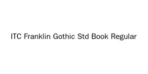
Designed by Rod McDonald
Designed by Jean-Baptiste Morizot