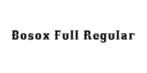
Bosox Full Regular
Slab Serif / DecorativeDesigned by Lee Gordon
Designed by Ray Larabie (Typodermic Fonts)
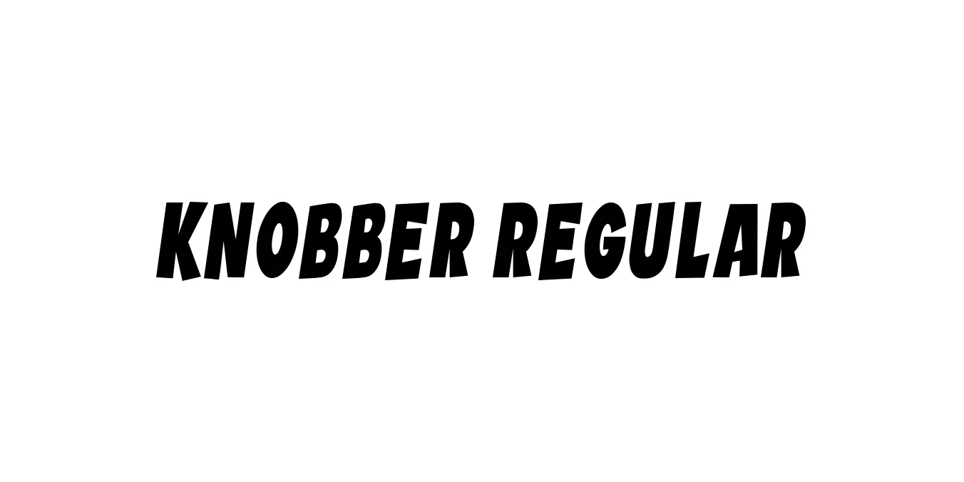
| Font Name | Knobber |
| Style | Regular |
| Category | Display / Heavy Sans-Serif |
| Designer | Ray Larabie (Typodermic Fonts) |
| Copyright | Copyright (c) 2020 by Vladimir Nikolic. All rights reserved. |
| License | Free for Personal Use |
| Total Character | 56 |
| Recommended Line Height | 0.8 |
| Ascent | 691 |
| Descent | 113 |
| Units Per em | 1000 |
| Total Vertical Range | 804 |
| Max Advance Width | 566 |
| Max Advance Height | N/A |
| Underline Position | -75 |
| Similar Fonts | Blippo, Frankfurter, Cooper Black |
Knobber Regular is a bold and expressive display typeface designed by the prolific Ray Larabie of Typodermic Fonts. Drawing inspiration from heavy, rounded lettering styles prevalent in the 1970s, this font features chunky proportions and soft, inviting curves. Its thick strokes and unique geometry give it a friendly yet powerful presence, making it an excellent choice for designers who want to bridge the gap between retro charm and modern playfulness.
The font is part of a larger family designed to command attention without feeling overly formal. Because of its solid structure and distinct personality, Knobber Regular has become a popular choice for high-impact visual communication. Its tight spacing and heavy weight ensure that headlines remain punchy and legible, providing a distinctive aesthetic that stands out in both print and digital environments.
Creating friendly, high-impact logos for casual and modern brands.
Perfect for toy packaging, snack labels, and energetic product designs.
Ideal for bold event posters and punchy advertising headlines.
Works exceptionally well for YouTube thumbnails and social media graphics.

Designed by Lee Gordon
Designed by Lee Gordon
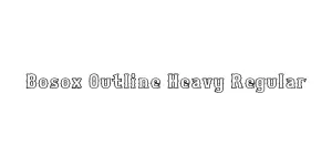
Designed by Lee Gordon
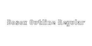
Designed by Lee Gordon