Kropotkin Condensed Bold
Designed by Yury Akulin
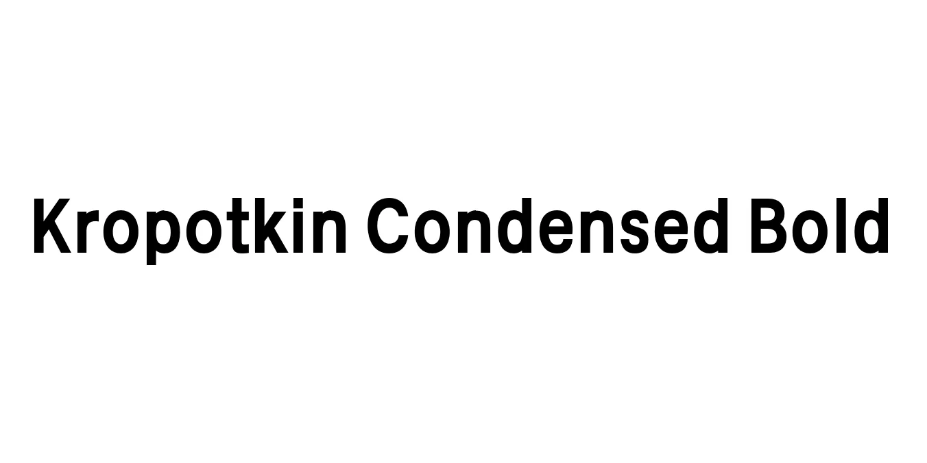
| Font Name | FSP DEMO - Kropotkin Cond Bold |
| Style | Cond Bold |
| Category | Serif / Display |
| Designer | Yury Akulin |
| Copyright | Copyright (c) 2008 by sugargliderz. All rights reserved. (Licence120521) |
| License | Free for Personal Use |
| Total Character | 95 |
| Recommended Line Height | 1 |
| Ascent | 1000 |
| Descent | 0 |
| Units Per em | 1000 |
| Total Vertical Range | 1000 |
| Max Advance Width | 847 |
| Max Advance Height | N/A |
| Underline Position | -75 |
| Similar Fonts | PT Serif, Playfair Display, Bodoni Condensed |
Kropotkin Condensed Bold Font Details : Font Free Download
Kropotkin Condensed Bold is a striking display serif typeface that draws significant inspiration from the graphic traditions of the early 20th century. Named after the philosopher Peter Kropotkin, this font family embodies a sense of rugged intellectualism and industrial strength. The Bold Condensed variant was specifically engineered to provide a high-impact visual presence in vertically-oriented or space-constrained layouts, making it a favorite for editorial designers looking for a retro-soviet or classic European aesthetic.
Technically, the font features strong vertical strokes and sharp, defined serifs that maintain clarity even in high-contrast printing scenarios. Its narrow proportions allow for longer words to fit comfortably in headlines without losing their commanding presence. This typeface is frequently used in projects that require a bridge between historical gravitas and modern graphic boldness, functioning effectively in both digital and print mediums.
Kropotkin Condensed Bold Best Uses
Perfect for striking magazine headlines and section headers.
Excellent for high-impact visual messaging and event posters.
Ideal for logos that require an authoritative and sturdy identity.
Great for creating high-contrast graphic overlays and bold quotes.
Kropotkin Condensed Bold Glyphs

Download Font
Package Size: 14.5 KB
Available Formats: .OTF