Kula Blur Regular
Designed by Mário Feliciano
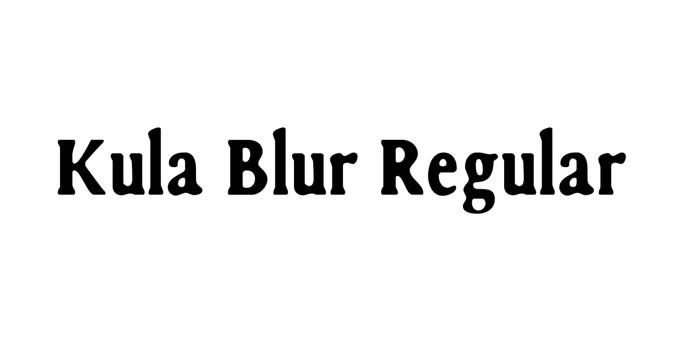
| Font Name | FSP DEMO - Kula Blur |
| Style | Regular |
| Category | Display / Stencil |
| Designer | Mário Feliciano |
| Copyright | Copyright (c) 2018 by Jaduger Design Studio. All rights reserved. |
| License | Free for Personal Use |
| Total Character | 95 |
| Recommended Line Height | 1.27 |
| Ascent | 1043 |
| Descent | 260 |
| Units Per em | 1024 |
| Total Vertical Range | 1303 |
| Max Advance Width | 897 |
| Max Advance Height | N/A |
| Underline Position | -175 |
| Similar Fonts | Caslon Stencil, Futura Stencil, Blippo |
Kula Blur Regular Font Details : Font Free Download
Kula Blur Regular is a stylistic extension of the original Kula typeface family, known for its heavy, stencil-inspired geometric forms. This specific version applies a softening filter to the character outlines, simulating the look of ink bleed on vintage paper or the weathered edges of a spray-painted industrial stencil. It successfully balances the rigid structure of a bold display font with a tactile, organic softness that makes it feel approachable and historic.
Designed to stand out in large formats, Kula Blur Regular is exceptionally effective for projects that require a retro or artisanal aesthetic. The softened edges reduce the harshness of its thick strokes, allowing it to blend seamlessly into textured backgrounds. It is widely used in contemporary graphic design for posters, book jackets, and branding where a human touch is needed within a strong, structural framework.
Kula Blur Regular Best Uses
Perfect for high-impact headlines that require a weathered, vintage look.
Ideal for industrial or artisanal brand identities seeking a rustic feel.
Works well for organic or heritage-focused product labels and containers.
Used for large-scale titles where a softened bold aesthetic is preferred over sharp edges.
Kula Blur Regular Glyphs
