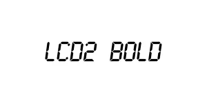
LCD2 Bold
Digital / TechnoDesigned by Samuel Reynolds
Designed by Samuel Reynolds
| Font Name | LCDMono2 |
| Style | Bold |
| Category | Monospaced / Digital |
| Designer | Samuel Reynolds |
| Copyright | Copyright © 1999 by Samuel Reynolds. All rights reserved. |
| License | Free for Personal Use |
| Total Character | 87 |
| Recommended Line Height | 0.89 |
| Ascent | 847 |
| Descent | 47 |
| Units Per em | 1000 |
| Total Vertical Range | 894 |
| Max Advance Width | 545 |
| Max Advance Height | N/A |
| Underline Position | -133 |
| Similar Fonts | Digital-7, DS-Digital, Segment7, LCD Mono, Dot Matrix |
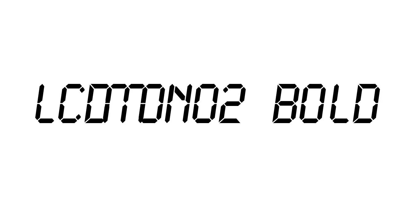
LCDMono2 Bold is a specialized monospaced typeface designed to emulate the look of early Liquid Crystal Displays (LCD). It is part of a larger family created by Samuel Reynolds, focusing on a fixed-width grid that mimics the physical segments found on calculators, digital watches, and electronic instrumentation. The bold weight offers enhanced visibility and impact, making it an excellent choice for headers and emphasized text within technical or futuristic layouts.
Historically, this font family has been a staple in the design world for projects requiring a retro-digital aesthetic. Its precise geometry and monospaced proportions ensure that characters align perfectly, which is vital for simulating terminal screens, digital clocks, or instrumentation panels. Whether used in high-tech user interfaces or experimental graphic art, LCDMono2 Bold provides a convincing and nostalgic digital feel that resonates with 1980s and 90s technology.
Ideal for creating dashboard displays, digital readouts, and simulated electronic interfaces.
Perfect for posters, flyers, and cover art with a cyberpunk or retro-technology theme.
Useful for styling code blocks or terminal windows that require a digital flair.
Suitable for tech-focused logos that want to emphasize a heritage in computing or electronics.

Package Size: 27.0 KB
Available Formats: .TTF
Designed by Samuel Reynolds
Designed by Suppasit Guasongserm

Designed by Suppasit Gidprasert