Lomax Regular
Sans SerifDesigned by Alan Meeks
Designed by Luc(as) de Groot
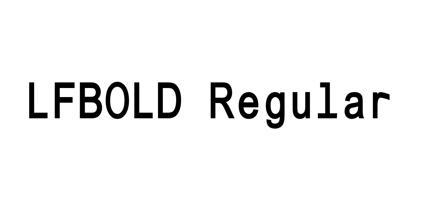
| Font Name | LFBOLD |
| Style | Regular |
| Category | Sans Serif |
| Designer | Luc(as) de Groot |
| Copyright | Typeface © The Monotype Corporation plc. Data © The Monotype Corporation plc/Type Solutions Inc.1990-1991 All Rights Reserved. |
| License | Free for Personal Use |
| Total Character | 185 |
| Recommended Line Height | 1.15 |
| Ascent | 1916 |
| Descent | 431 |
| Units Per em | 2048 |
| Total Vertical Range | 2347 |
| Max Advance Width | 1916 |
| Max Advance Height | N/A |
| Underline Position | -217 |
| Similar Fonts | TheSans, Helvetica, Corbel, Lucida Sans |
LFBOLD Regular is a high-performance typeface designed to deliver maximum impact while maintaining a refined, professional aesthetic. It features a robust weight and a clean, geometric structure that ensures superior legibility across various digital and print media. The font's wide stance and open counters make it an excellent choice for designers who need a typeface that commands attention without sacrificing readability or grace.
Originating from the LucasFonts design philosophy, this particular weight was meticulously crafted to serve high-end corporate identities and rigorous editorial layouts. Over the years, LFBOLD Regular has become a staple for professional environments, appreciated for its neutral yet sophisticated tone. It effectively bridges the gap between traditional Swiss typography and modern digital requirements, making it a versatile and reliable tool in any modern designer's toolkit.
Ideal for creating strong and memorable corporate logos and identity systems.
Highly effective for bold headers, hero sections, and navigation menus.
Perfect for brochures, posters, and high-impact book covers.
Excellent for environmental graphics and wayfinding systems due to high legibility.

Designed by Alan Meeks
Designed by Besarion Paata Gugushvili (BPG InfoTech)

Designed by Dan Cassaro

Designed by Catur Argi