Lorimer No 2 Condensed Black Regular
Designed by James Montalbano
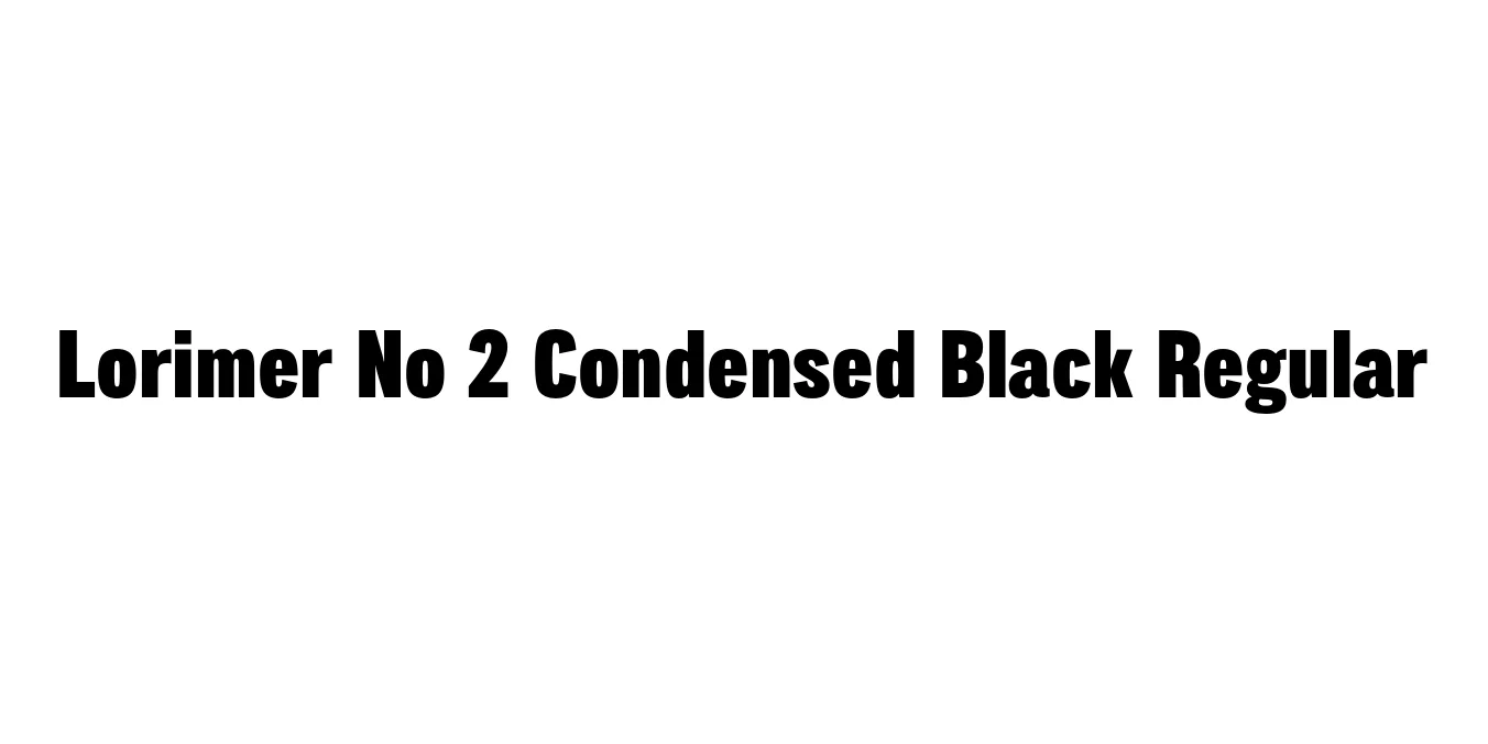
| Font Name | Lorimer No 2 Trial Condensed Black |
| Style | Regular |
| Category | Sans Serif |
| Designer | James Montalbano |
| Copyright | Copyright (c) 2011 by James Puckett. All rights reserved. |
| License | Commercial License Required / Demo |
| Total Character | 345 |
| Recommended Line Height | 1.2 |
| Ascent | 960 |
| Descent | 240 |
| Units Per em | 1000 |
| Total Vertical Range | 1200 |
| Max Advance Width | 860 |
| Max Advance Height | N/A |
| Underline Position | -75 |
| Similar Fonts | Impact, Helvetica Condensed Bold, Franklin Gothic Heavy Condensed |
Lorimer No 2 Condensed Black Regular Font Details : Font Free Download
Lorimer No 2 Condensed Black Regular is a robust and impactful sans-serif typeface designed by James Montalbano of Terminal Design. This specific weight is part of the broader Lorimer No 2 family, which was developed to provide a contemporary take on classic condensed gothic styles. The "Black" weight offers a massive visual presence while the "Condensed" width allows designers to fit significant messaging into narrow columns or tight horizontal spaces without sacrificing legibility or style.
The design features clean lines and a high x-height, making it exceptionally versatile for both digital and print media. While it draws inspiration from early 20th-century sans-serifs, it eliminates superfluous ornamentation to achieve a minimalist and professional aesthetic. It is frequently utilized in editorial design, bold advertising campaigns, and corporate branding where a sense of strength and urgency is required.
Lorimer No 2 Condensed Black Regular Best Uses
Perfect for bold magazine headlines and cover titles.
High-impact visual communication for posters and billboards.
Strong, attention-grabbing hero sections and banners.
Ideal for tight columns where width is restricted but weight is needed.
Lorimer No 2 Condensed Black Regular Glyphs
