Lorimer No 2 Condensed Bold
Designed by James Montalbano
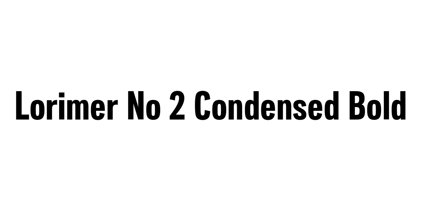
| Font Name | Lorimer No 2 Trial Condensed |
| Style | Bold |
| Category | Sans Serif |
| Designer | James Montalbano |
| Copyright | Copyright (c) 2011 by James Puckett. All rights reserved. |
| License | Free for Personal Use |
| Total Character | 345 |
| Recommended Line Height | 1.2 |
| Ascent | 960 |
| Descent | 240 |
| Units Per em | 1000 |
| Total Vertical Range | 1200 |
| Max Advance Width | 743 |
| Max Advance Height | N/A |
| Underline Position | -75 |
| Similar Fonts | Helvetica Condensed, Franklin Gothic Condensed, Akzidenz-Grotesk Bold Condensed |
Lorimer No 2 Condensed Bold Font Details : Font Free Download
Lorimer No 2 Condensed Bold is a sophisticated sans-serif typeface designed by James Montalbano and released through Terminal Design. The font is a contemporary revival and refinement of the 19th-century grotesque style, stripping away the irregularities of historical wood and metal types while retaining their sturdy, industrial character. This specific weight was crafted to provide a clean, modern aesthetic that balances historical weight with digital precision.
The Condensed Bold iteration is specifically tailored for space-constrained environments that require high visual impact. Its narrow width allows for large-scale typography in tight layouts, making it an essential tool for editorial designers working on magazines and news media. With its clear terminals and balanced negative space, the font remains highly legible even in its heaviest and narrowest forms, providing a professional and authoritative tone to any graphic design project.
Lorimer No 2 Condensed Bold Best Uses
Ideal for newspaper and magazine headlines where space is limited.
Perfect for high-impact event posters and large-scale advertisements.
Used for professional corporate identities requiring a strong, industrial look.
Great for sidebar menus and UI elements with restricted horizontal space.
Lorimer No 2 Condensed Bold Glyphs
