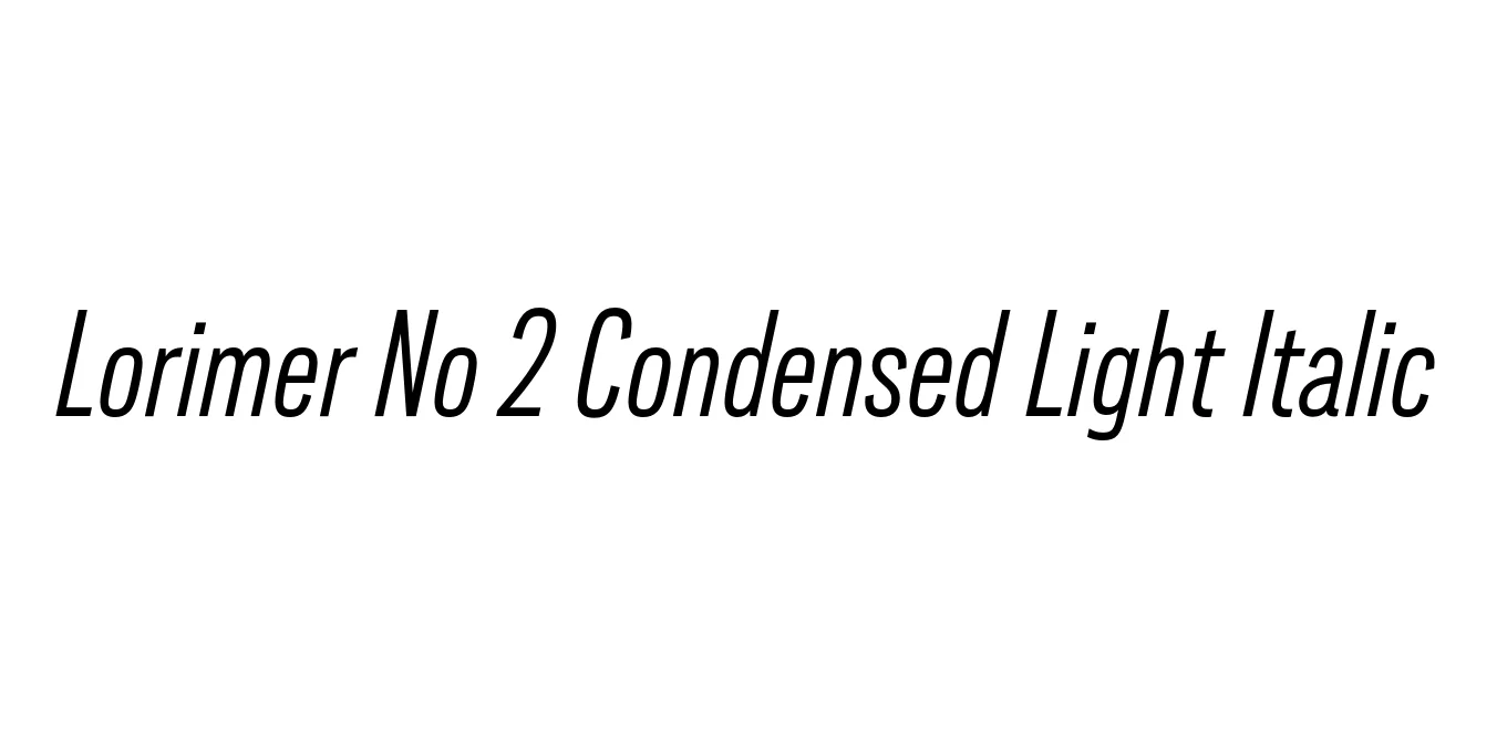
Lorimer No 2 Condensed Light Italic
Designed by James Montalbano
| Font Name | Lorimer No 2 Trial Condensed Light |
| Style | Italic |
| Category | Sans Serif |
| Designer | James Montalbano |
| Copyright | Copyright (c) 2011 by James Puckett. All rights reserved. |
| License | Commercial (License Required) |
| Total Character | 345 |
| Recommended Line Height | 1.2 |
| Ascent | 960 |
| Descent | 240 |
| Units Per em | 1000 |
| Total Vertical Range | 1200 |
| Max Advance Width | 722 |
| Max Advance Height | N/A |
| Underline Position | -75 |
| Similar Fonts | Franklin Gothic, News Gothic, Trade Gothic, Benton Sans |
Lorimer No 2 Condensed Light Italic Font Details : Font Free Download
Lorimer No 2 Condensed Light Italic is a refined sans-serif typeface designed by James Montalbano of Terminal Design. This font family serves as a contemporary interpretation of 19th-century grotesque styles, stripping away excess ornamentation to focus on legibility and rhythmic spacing. It is particularly valued for its balance between a mechanical structure and a humanistic touch, making it versatile for both digital and print environments.
The Condensed Light Italic variant is specifically engineered for high-density layouts where horizontal space is at a premium. Its slender letterforms and delicate slant provide a sophisticated aesthetic that works exceptionally well in editorial design, luxury branding, and complex informational hierarchies. Whether used for pull-quotes or subtle interface elements, it maintains a clean, professional appearance that enhances overall readability.
Lorimer No 2 Condensed Light Italic Best Uses
Perfect for magazine layouts and narrow columns.
Ideal for high-end fashion or luxury tech logos.
Effective for small print or legal disclaimers in sleek advertisements.
Great for secondary navigation and sophisticated footer text.
Lorimer No 2 Condensed Light Italic Glyphs

Download Font
Package Size: 55.4 KB
Available Formats: .OTF