Lorimer No 2 Condensed Regular
Designed by James Montalbano
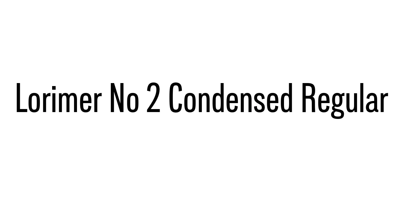
| Font Name | Lorimer No 2 Trial Condensed |
| Style | Regular |
| Category | Sans Serif |
| Designer | James Montalbano |
| Copyright | Copyright (c) 2011 by James Puckett. All rights reserved. |
| License | Free for Personal Use / Demo |
| Total Character | 345 |
| Recommended Line Height | 1.2 |
| Ascent | 960 |
| Descent | 240 |
| Units Per em | 1000 |
| Total Vertical Range | 1200 |
| Max Advance Width | 725 |
| Max Advance Height | N/A |
| Underline Position | -75 |
| Similar Fonts | Franklin Gothic Condensed, News Gothic, Alternate Gothic |
Lorimer No 2 Condensed Regular Font Details : Font Free Download
Lorimer No 2 Condensed Regular is a creation of James Montalbano of Terminal Design. It belongs to a larger family of sans-serif typefaces that find their roots in the 19th-century "Grotesque" style. This specific font was designed to capture the aesthetic of vernacular typography often seen in New York City signage, blending a sturdy industrial feel with refined modern proportions suitable for digital and print media alike.
The Condensed Regular variant is characterized by its tall x-height and narrow character widths, making it an exceptional choice for space-saving layouts. Its design provides a sense of clarity and authority without feeling overly aggressive. Over the years, it has become a staple for designers who require a versatile gothic typeface that maintains legibility even in complex information hierarchies or tight editorial columns.
Lorimer No 2 Condensed Regular Best Uses
Ideal for creating impactful and space-efficient titles in magazines.
Perfect for narrow newspaper columns and complex information design.
Provides a clean and modern look for navigation menus and UI elements.
Suitable for information-heavy labels where space is at a premium.
Lorimer No 2 Condensed Regular Glyphs

Download Font
Package Size: 53.2 KB
Available Formats: .OTF