Lorimer No 2 Condensed Semibold Italic
Designed by James Montalbano
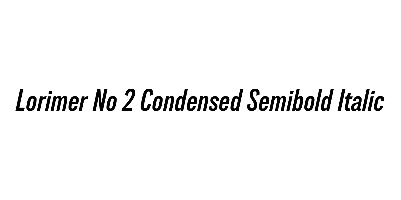
| Font Name | Lorimer No 2 Trial Condensed Semibold |
| Style | Italic |
| Category | Sans-serif |
| Designer | James Montalbano |
| Copyright | Copyright (c) 2011 by James Puckett. All rights reserved. |
| License | Free for Personal Use |
| Total Character | 345 |
| Recommended Line Height | 1.2 |
| Ascent | 960 |
| Descent | 240 |
| Units Per em | 1000 |
| Total Vertical Range | 1200 |
| Max Advance Width | 724 |
| Max Advance Height | N/A |
| Underline Position | -75 |
| Similar Fonts | Franklin Gothic Condensed, Helvetica Compressed, Trade Gothic |
Lorimer No 2 Condensed Semibold Italic Font Details : Font Free Download
Lorimer No 2 is a refined sans-serif family designed by James Montalbano of Terminal Design. It represents a more contemporary and polished evolution of the original Lorimer series. The Condensed Semibold Italic weight offers a robust yet space-efficient profile, characterized by its clean vertical lines and rhythmic slant, making it ideal for modern editorial layouts and high-impact headlines.
The architecture of this typeface draws inspiration from mid-20th-century grotesques but incorporates a distinct digital clarity. Its Semibold Italic variant provides the necessary emphasis for pull quotes, captions, and sidebars without sacrificing legibility in narrow columns. It serves as a versatile tool for designers looking for a balance between industrial strength and sophisticated elegance.
Lorimer No 2 Condensed Semibold Italic Best Uses
Perfect for magazine headings and sidebar text where space is limited.
Ideal for responsive navigation menus and bold UI elements.
Excellent for corporate identity projects requiring a strong, modern voice.
High impact for posters, flyers, and digital banners.
Lorimer No 2 Condensed Semibold Italic Glyphs

Download Font
Package Size: 57.4 KB
Available Formats: .OTF