Lorimer No 2 Light Italic
Designed by James Montalbano
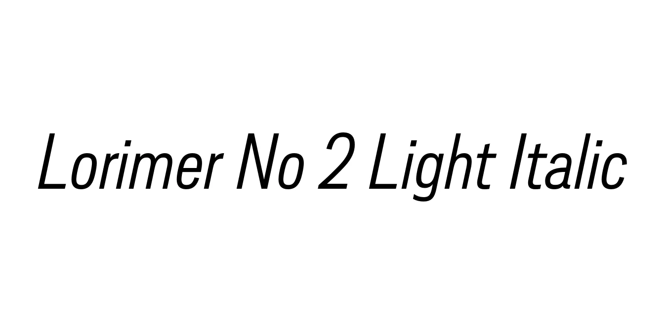
| Font Name | Lorimer No 2 Trial Light |
| Style | Italic |
| Category | Sans Serif |
| Designer | James Montalbano |
| Copyright | Copyright (c) 2011 by James Puckett. All rights reserved. |
| License | Free for Personal Use |
| Total Character | 345 |
| Recommended Line Height | 1.2 |
| Ascent | 960 |
| Descent | 240 |
| Units Per em | 1000 |
| Total Vertical Range | 1200 |
| Max Advance Width | 900 |
| Max Advance Height | N/A |
| Underline Position | -75 |
| Similar Fonts | Akzidenz-Grotesk, Franklin Gothic, Trade Gothic |
Lorimer No 2 Light Italic Font Details : Font Free Download
Lorimer No 2 is an expansion of the original Lorimer family designed by James Montalbano of Terminal Design. It draws inspiration from 19th-century grotesque typefaces, specifically those found in American wood type and metal type specimens from the late 1800s. The Light Italic weight offers a sleek, sophisticated lean that maintains high legibility while adding a sense of movement and professional elegance to modern layouts.
This typeface is characterized by its clean lines, open counters, and a neutral yet distinct personality, making it highly versatile for both print and digital media. Terminal Design released this version to provide designers with a broader range of weights and widths, ensuring that the Lorimer No 2 family remains a robust choice for complex typographic hierarchies, high-end branding projects, and editorial environments.
Lorimer No 2 Light Italic Best Uses
Perfect for pull quotes and body text that requires a sophisticated emphasis.
Ideal for minimalist logos and high-end corporate identity systems.
Clean and legible for digital interfaces and navigational elements.
Lorimer No 2 Light Italic Glyphs

Download Font
Package Size: 54.9 KB
Available Formats: .OTF