Lorimer No 2 Regular
Designed by James Montalbano
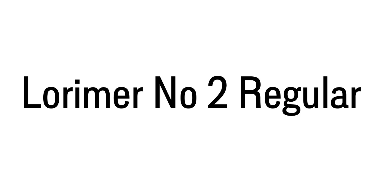
| Font Name | Lorimer No 2 Trial |
| Style | Regular |
| Category | Sans Serif |
| Designer | James Montalbano |
| Copyright | Copyright (c) 2011 by James Puckett. All rights reserved. |
| License | Commercial License Required / Demo available |
| Total Character | 345 |
| Recommended Line Height | 1.2 |
| Ascent | 960 |
| Descent | 240 |
| Units Per em | 1000 |
| Total Vertical Range | 1200 |
| Max Advance Width | 913 |
| Max Advance Height | N/A |
| Underline Position | -75 |
| Similar Fonts | Franklin Gothic, News Gothic, Trade Gothic, Akzidenz-Grotesk |
Lorimer No 2 Regular Font Details : Font Free Download
Lorimer No 2 Regular is a sophisticated sans-serif typeface created by James Montalbano of Terminal Design. Rooted in the sturdy traditions of 19th-century American grotesques, this typeface was developed to offer a more modern and refined alternative to its predecessors. It strikes a unique balance between industrial utility and contemporary elegance, making it a versatile tool for designers who require a font that feels both historical and fresh.
The design of Lorimer No 2 features a cohesive structure with improved weight distribution and optimized proportions compared to the original Lorimer series. Its clean lines and open apertures ensure excellent legibility across various media platforms. Whether used in high-density editorial layouts or minimalist digital interfaces, the font maintains a professional and reliable presence that commands attention without being overbearing.
Lorimer No 2 Regular Best Uses
Excellent for magazine spreads and newspaper body text due to its high legibility.
Provides a clean, professional look for logos, business cards, and brand guidelines.
Strong, geometric forms make it ideal for impactful titles and large-scale signage.
Its balanced proportions work well for clean web interfaces and mobile applications.
Lorimer No 2 Regular Glyphs

Download Font
Package Size: 53.0 KB
Available Formats: .OTF