Lorimer No 2 Semibold Italic
Designed by James Montalbano
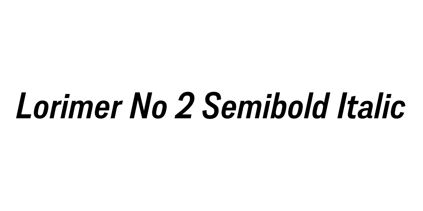
| Font Name | Lorimer No 2 Trial Semibold |
| Style | Italic |
| Category | Sans Serif |
| Designer | James Montalbano |
| Copyright | Copyright (c) 2011 by James Puckett. All rights reserved. |
| License | Commercial License Required / Demo available |
| Total Character | 345 |
| Recommended Line Height | 1.2 |
| Ascent | 960 |
| Descent | 240 |
| Units Per em | 1000 |
| Total Vertical Range | 1200 |
| Max Advance Width | 938 |
| Max Advance Height | N/A |
| Underline Position | -75 |
| Similar Fonts | Helvetica, Akzidenz Grotesk, Univers, Franklin Gothic |
Lorimer No 2 Semibold Italic Font Details : Font Free Download
Lorimer No 2 Semibold Italic is a contemporary grotesque sans-serif typeface designed by James Montalbano of Terminal Design. This specific iteration builds upon the foundational principles of the original Lorimer family, offering a more robust and refined aesthetic suitable for modern high-resolution displays and high-quality print. The design is characterized by its balanced proportions and subtle industrial influences, which provide a professional yet approachable tone for a wide variety of graphic design projects.
The Semibold Italic weight adds a dynamic sense of motion and emphasis to the family. Its slanted forms are meticulously crafted to maintain legibility while injecting personality into editorial layouts and branding systems. This typeface excels in environments where clarity is paramount but a distinct visual identity is desired, making it a favorite among designers working on corporate identities, complex information design, and sleek, minimalist web interfaces.
Lorimer No 2 Semibold Italic Best Uses
Ideal for professional corporate logos and visual identities.
Perfect for pull quotes and emphasis in magazines or journals.
Clean and legible for UI elements and bold headers.
Strong presence for wayfinding and environmental graphics.
Lorimer No 2 Semibold Italic Glyphs

Download Font
Package Size: 56.6 KB
Available Formats: .OTF