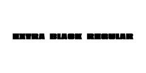
Extra Black Regular
Sans Serif / DisplayDesigned by Linotype Design Studio
Designed by Chris Simpson
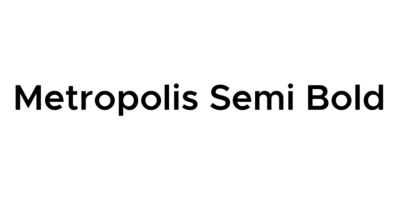
| Font Name | Metropolis Semi Bold |
| Style | Regular |
| Category | Geometric Sans-Serif |
| Designer | Chris Simpson |
| Copyright | Copyright © 2016 by Chris Simpson. |
| License | Free For Commercial Use (OFL) |
| Total Character | 287 |
| Recommended Line Height | 1 |
| Ascent | 795 |
| Descent | 205 |
| Units Per em | 1000 |
| Total Vertical Range | 1000 |
| Max Advance Width | 1203 |
| Max Advance Height | N/A |
| Underline Position | -123 |
| Similar Fonts | Gotham, Proxima Nova, Montserrat, Futura |
Metropolis Semi Bold is a modern, geometric sans-serif typeface designed by Chris Simpson. Drawing inspiration from iconic typefaces like Gotham and Proxima Nova, Metropolis was crafted to offer high readability and a clean, minimalist aesthetic. The project was born out of a desire to create a versatile, open-source font that could handle the demands of contemporary digital design while maintaining a classic, professional feel.
This typeface is known for its balanced proportions and wide range of weights, making it an excellent choice for both display and body text. The Semi Bold weight, in particular, provides enough visual weight to stand out in headlines without losing the elegant, geometric structure that defines the family. Its balanced x-height and open apertures ensure clarity across various resolutions and printing formats.
Ideal for professional logos and corporate identity systems.
Perfect for clean, modern user interfaces and navigation bars.
The semi-bold weight offers great impact for titles and call-to-actions.
Highly legible for brochures, posters, and magazine layouts.

Package Size: 22.9 KB
Available Formats: .OTF
Designed by Linotype Design Studio
Designed by Letterara
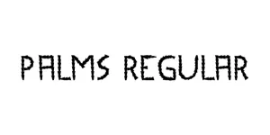
Designed by A.S. Meijer
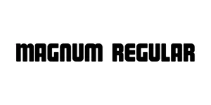
Designed by Hendra Pratama (HP Typework)