LG Smart Italic
Sans SerifDesigned by LG Electronics Design Team
Designed by Chris Simpson
| Font Name | Metropolis Semi Bold |
| Style | Italic |
| Category | Sans Serif |
| Designer | Chris Simpson |
| Copyright | Copyright © 2016 by Chris Simpson. |
| License | Free For Commercial Use |
| Total Character | 287 |
| Recommended Line Height | 1 |
| Ascent | 795 |
| Descent | 205 |
| Units Per em | 1000 |
| Total Vertical Range | 1000 |
| Max Advance Width | 1209 |
| Max Advance Height | N/A |
| Underline Position | -123 |
| Similar Fonts | Gotham, Montserrat, Proxima Nova, Futura |
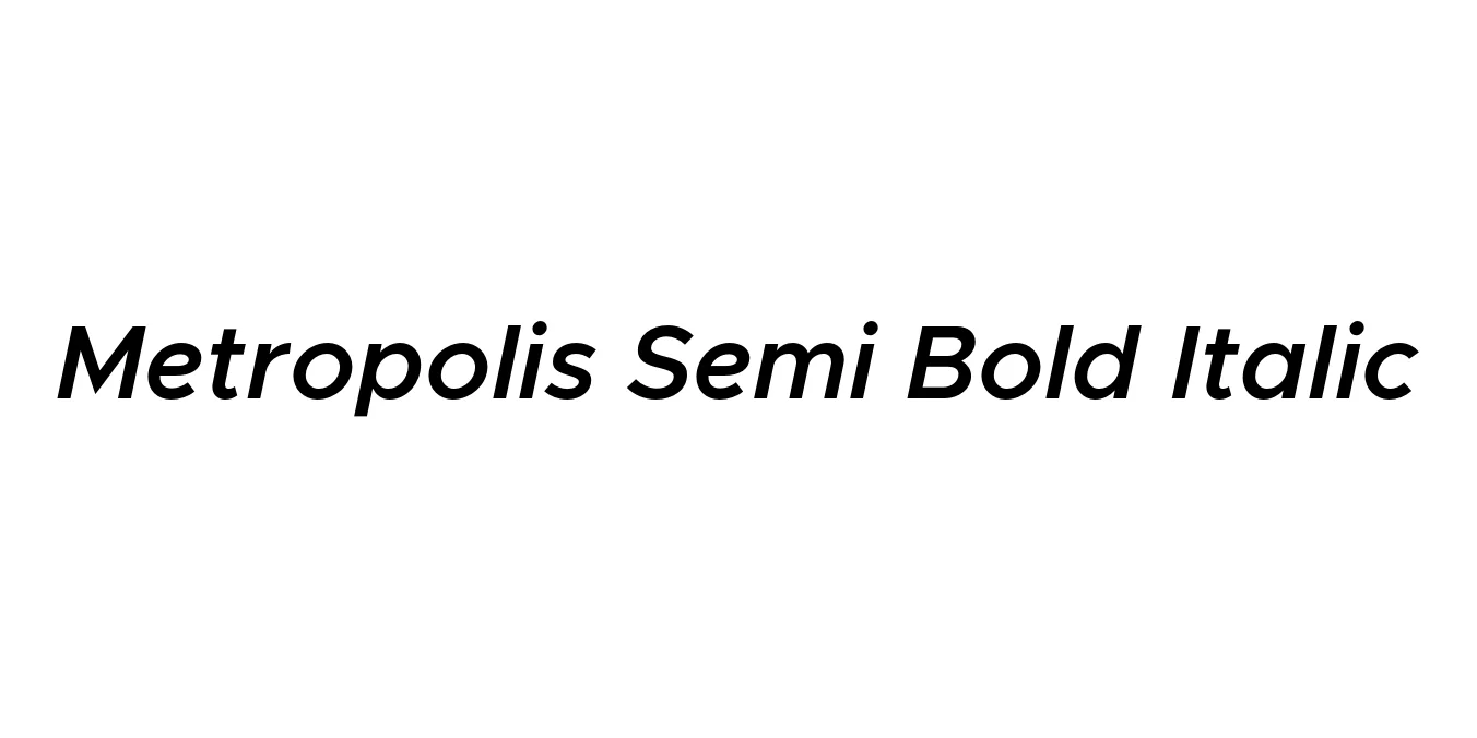
Metropolis Semi Bold Italic was designed by Chris Simpson as a modern, open-source geometric sans-serif typeface. Drawing heavy inspiration from iconic fonts like Gotham and Proxima Nova, it was crafted to provide a clean, professional, and highly legible aesthetic that works across all digital and print platforms. The semi-bold weight combined with a dynamic italic slant offers a sense of speed and forward-thinking authority.
The font is celebrated for its geometric construction and meticulous optical corrections, ensuring that it remains readable even at small sizes. As part of a larger, versatile family, the Semi Bold Italic variant is frequently chosen by designers who need to create emphasis and modern flair in high-performance user interfaces and contemporary branding projects.
Creating powerful, modern corporate identities and logos.
Clean and readable navigation menus and call-to-action buttons.
Dynamic slogans and promotional graphics that require a sense of movement.
Emphasis in magazine layouts, pull-quotes, and sub-headings.

Designed by LG Electronics Design Team
Designed by VMware
Designed by VMware
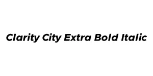
Designed by VMware Clarity Design Team