Affirmative Regular
Slab Serif / AthleticDesigned by Zenoz Design

Designed by Isabella Ahmadzadeh
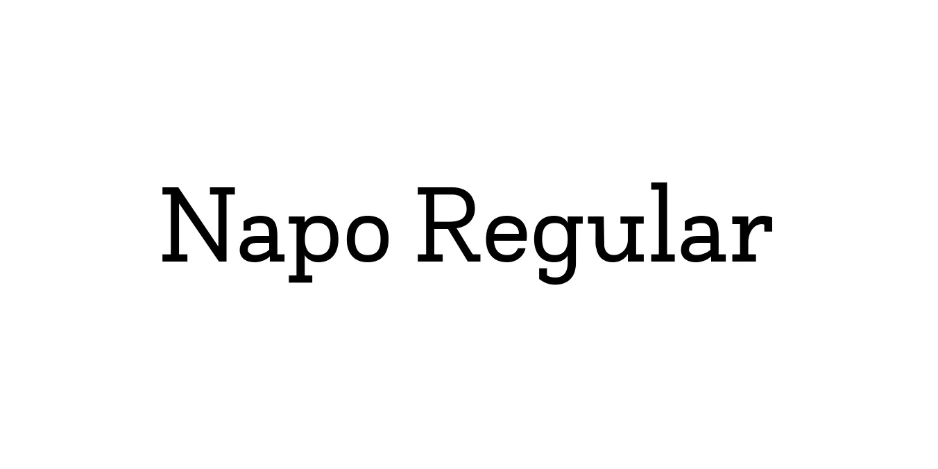
| Font Name | Napo |
| Style | Regular |
| Category | Slab Serif |
| Designer | Isabella Ahmadzadeh |
| Copyright | Copyright (c) 2016 by Isabella Ahmadzadeh. All rights reserved. |
| License | Free for Personal Use |
| Total Character | 367 |
| Recommended Line Height | 1.2 |
| Ascent | 2067 |
| Descent | 391 |
| Units Per em | 2048 |
| Total Vertical Range | 2458 |
| Max Advance Width | 2087 |
| Max Advance Height | N/A |
| Underline Position | -72 |
| Similar Fonts | Archer, Museo Slab, Clarendon, Josefin Slab |
Napo Regular is a sophisticated slab serif typeface designed by Isabella Ahmadzadeh and published through the Zetafonts foundry. Originally conceived as a bespoke font for a specific branding project, the typeface was later expanded into a comprehensive family that balances the industrial strength of slab serifs with the warmth of humanistic proportions. This dual nature allows the font to feel both authoritative and approachable, making it a standout choice for modern typographic systems.
The design of Napo Regular features a generous x-height and carefully modulated slabs that ensure high legibility even at smaller point sizes. It was designed to work harmoniously with its sister family, Napo Sans, providing designers with a versatile toolkit for complex editorial layouts and brand identity systems. Its clean lines and balanced spacing make it equally effective for traditional print media and high-resolution digital displays.
Ideal for creating strong, stable corporate identities and memorable logotypes.
Excellent for magazine layouts and long-form body text due to its high readability.
Highly effective for headers and UI elements in professional digital interfaces.

Package Size: 152.5 KB
Available Formats: .TTF
Designed by Zenoz Design
Designed by SVN (Style-no.1)
Designed by František Štorm

Designed by Monotype Design Studio