New York City Normal
Designed by Susan Kare
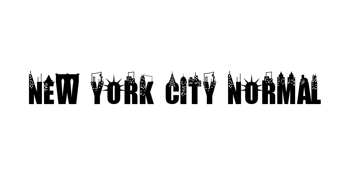
| Font Name | New York City |
| Style | Normal |
| Category | Serif |
| Designer | Susan Kare |
| Copyright | Typeface © Cpr.Sparhelt 2009. All Rights Reserved |
| License | Free for Personal Use |
| Total Character | 64 |
| Recommended Line Height | 0.8 |
| Ascent | 1638 |
| Descent | 1 |
| Units Per em | 2048 |
| Total Vertical Range | 1639 |
| Max Advance Width | 1202 |
| Max Advance Height | N/A |
| Underline Position | -217 |
| Similar Fonts | Times New Roman, Georgia, Charter, Times |
New York City Normal Font Details : Font Free Download
New York City Normal is a distinguished serif typeface that holds a significant place in the history of digital typography. Originally conceived as part of the system fonts for the early Macintosh computers in the 1980s, it was designed to offer high legibility on lower-resolution screens. This transitional serif style draws inspiration from classic newspaper fonts, providing a sense of authority, reliability, and timeless elegance that has allowed it to remain relevant across decades of design evolution.
The typeface is defined by its clean proportions, moderate stroke contrast, and structured serifs, which make it exceptionally well-suited for editorial content and professional documentation. Whether used in digital interfaces or printed media, New York City Normal conveys a professional and sophisticated tone. Its ability to balance vintage charm with modern utility makes it a versatile tool for designers aiming for a classic, high-end aesthetic in their branding and layout projects.
New York City Normal Best Uses
Excellent for magazine layouts, newspapers, and long-form articles.
Perfect for high-end corporate identities and luxury logo designs.
Ideal for sophisticated headings and legible body text on professional websites.
Highly effective for books, academic papers, and official documents.
New York City Normal Glyphs
