Nokia Exp Outline XBold Italic
Designed by Erik Spiekermann & Ole Schäfer
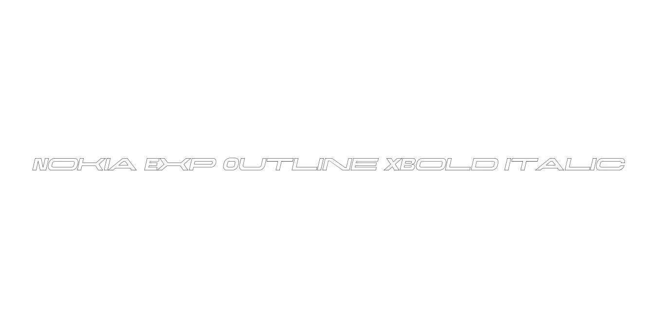
| Font Name | Nokia Exp Outline XBold |
| Style | Italic |
| Category | Sans Serif / Display |
| Designer | Erik Spiekermann & Ole Schäfer |
| Copyright | Alfin Weniardi Indarto |
| License | Free for Personal Use |
| Total Character | 226 |
| Recommended Line Height | 1.3 |
| Ascent | 1000 |
| Descent | 300 |
| Units Per em | 1000 |
| Total Vertical Range | 1300 |
| Max Advance Width | 2992 |
| Max Advance Height | N/A |
| Underline Position | -100 |
| Similar Fonts | Nokia Sans, Univers, Frutiger, Helvetica Rounded |
Nokia Exp Outline XBold Italic Font Details : Font Free Download
Nokia Exp Outline XBold Italic is a specialized variant of the corporate typeface family originally developed for the Finnish telecommunications giant, Nokia. This specific style is part of the expanded (Exp) sub-family, featuring a high-impact extra bold weight with a dynamic italic slant and a distinctive outline effect. Its design philosophy stems from the early 2000s tech boom, where industrial precision and digital clarity were paramount for global branding consistency.
The typeface is characterized by its open apertures and sturdy construction, which ensures that the outline remains legible even at smaller display sizes. While the solid versions of this family were built for user interfaces and documentation, the Outline XBold Italic version was crafted specifically for high-visibility marketing, headlines, and creative display work. It represents a bridge between functional corporate typography and expressive graphic design, making it a nostalgic yet powerful choice for modern projects.
Nokia Exp Outline XBold Italic Best Uses
Excellent for tech-focused brand identities and modern corporate logos.
Perfect for high-impact titles on posters, flyers, and website banners.
Ideal for sci-fi or futuristic game interfaces and promotional graphics.
Works well for bold, industrial-style typography on streetwear and merchandise.
Nokia Exp Outline XBold Italic Glyphs
