Nokia Expanded Black Outline Regular
Designed by Nokia Design Team
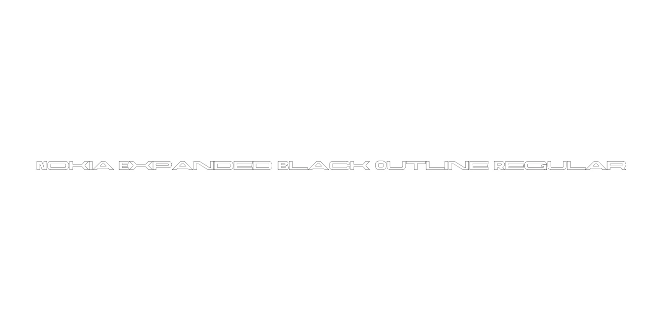
| Font Name | Nokia Expanded Black Outline |
| Style | Regular |
| Category | Sans Serif |
| Designer | Nokia Design Team |
| Copyright | Alfin Weniardi Indarto |
| License | Free for Personal Use |
| Total Character | 235 |
| Recommended Line Height | 1.3 |
| Ascent | 1000 |
| Descent | 300 |
| Units Per em | 1000 |
| Total Vertical Range | 1300 |
| Max Advance Width | 2970 |
| Max Advance Height | N/A |
| Underline Position | -100 |
| Similar Fonts | Eurostile, Microgramma, Nokia Pure, Helvetica Outline |
Nokia Expanded Black Outline Regular Font Details : Font Free Download
Nokia Expanded Black Outline Regular is a distinctive variation of the iconic corporate typeface used by the Finnish telecommunications leader during its era of global mobile dominance. This specific variant emphasizes an expanded width and a bold outline aesthetic, capturing the futuristic and industrial spirit of early 2000s technology branding. It was engineered to maintain high visibility and a structural presence that reflects durability and innovation.
The font is characterized by its clean geometric lines and wide stance, which provide a sense of stability and modernity. The outline effect allows for creative layering in graphic design, making it an excellent choice for designers looking to evoke retro-tech nostalgia or build high-impact display layouts. Its balanced proportions ensure that even as a decorative outline face, it remains legible and authoritative across digital and print mediums.
Nokia Expanded Black Outline Regular Best Uses
Perfect for technology-focused logos and corporate identity projects.
Excellent for high-impact headlines that require a bold, hollowed-out look.
Ideal for futuristic user interfaces and gamified dashboard displays.
Highly effective for animated text overlays and kinetic typography.
Nokia Expanded Black Outline Regular Glyphs
