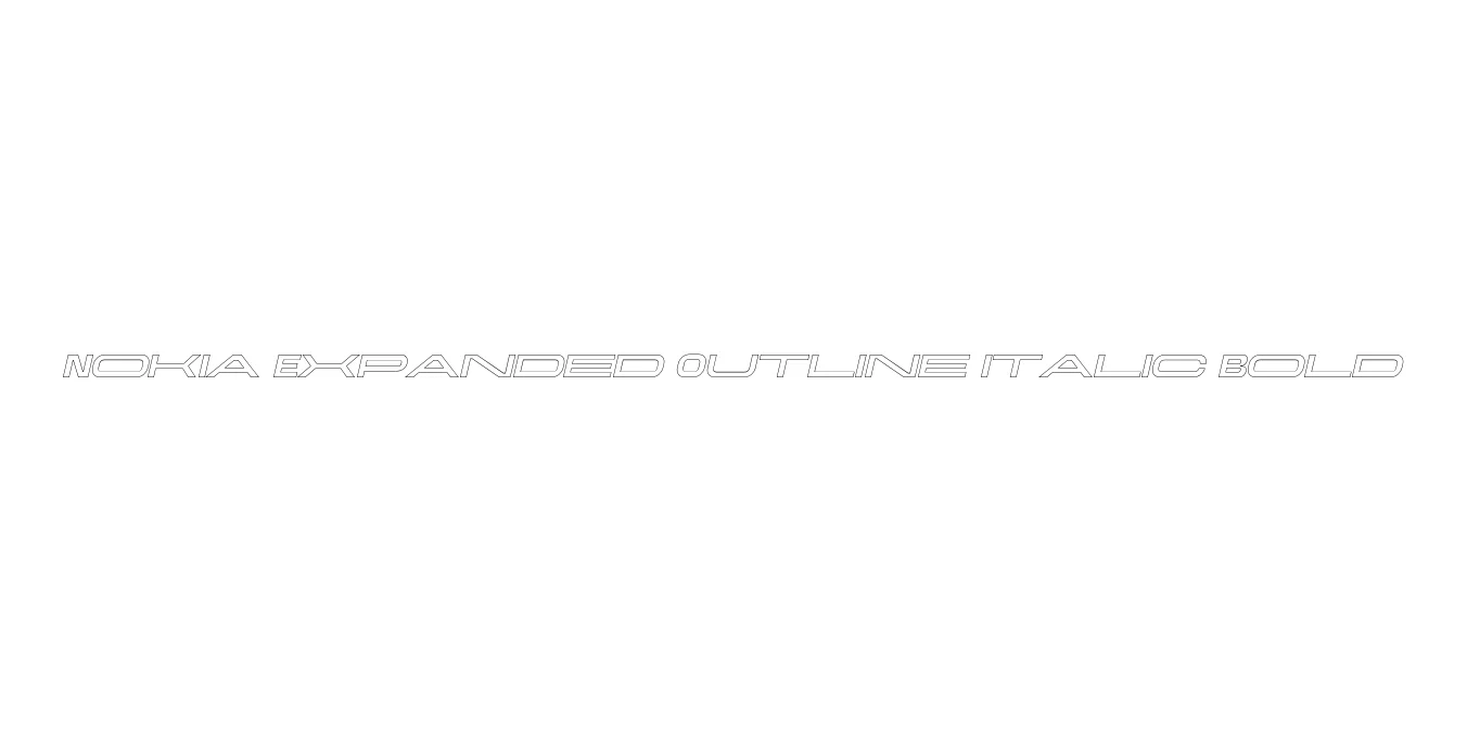
Nokia Expanded Outline Italic Bold
Designed by Nokia Corporation
| Font Name | Nokia Expanded Outline Italic |
| Style | Bold |
| Category | Techno / Sans Serif |
| Designer | Nokia Corporation |
| Copyright | Alfin Weniardi Indarto |
| License | Free for Personal Use |
| Total Character | 235 |
| Recommended Line Height | 1.3 |
| Ascent | 1000 |
| Descent | 300 |
| Units Per em | 1000 |
| Total Vertical Range | 1300 |
| Max Advance Width | 3014 |
| Max Advance Height | N/A |
| Underline Position | -100 |
| Similar Fonts | Bank Gothic, Univers Expanded, Nokia Pure |
Nokia Expanded Outline Italic Bold Font Details : Font Free Download
Nokia Expanded Outline Italic Bold is a stylized variant of the classic Nokia typography that defined the mobile era of the late 1990s and early 2000s. This specific weight combines a heavy, expanded width with an italic slant and a hollow outline effect, creating a look that is both authoritative and futuristic. It was originally part of a broader family intended to ensure brand consistency across various digital and physical media platforms during the company's global expansion.
The typeface is characterized by its wide stance and geometric precision, which were designed to remain legible even in challenging display environments. As an outline font, it serves as a powerful display face, perfect for titles that need to stand out without feeling overly heavy. It captures a specific sense of technological nostalgia, making it a favorite for designers looking to evoke the aesthetic of early digital communication and mobile technology.
Nokia Expanded Outline Italic Bold Best Uses
Excellent for creating tech-focused logos and corporate identity materials.
Perfect for futuristic headers and high-impact digital banners.
Works well for large-scale typography that requires a retro-tech aesthetic.
Great for sci-fi or retro-themed game menus and interfaces.
Nokia Expanded Outline Italic Bold Glyphs
