Nokia Expanded Outline Italic SmBd Regular
Designed by Nokia Corporation / Dalton Maag
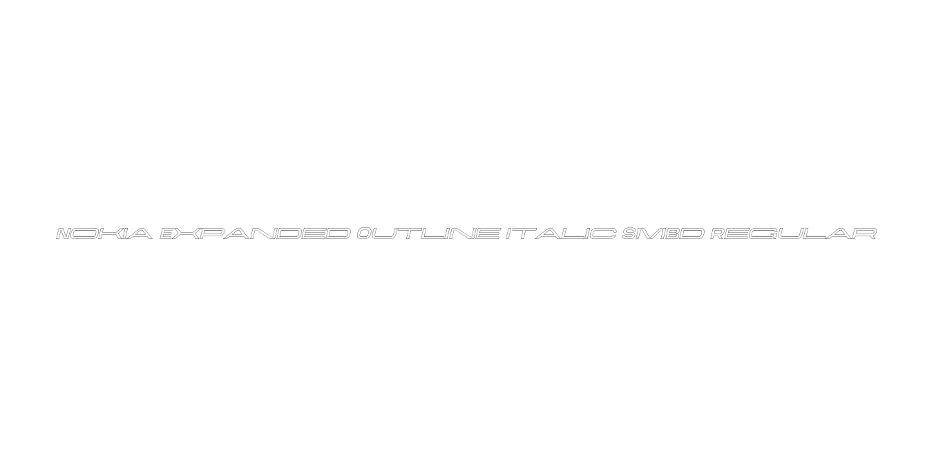
| Font Name | Nokia Expanded Outline Italic SmBd |
| Style | Regular |
| Category | Display / Sans Serif |
| Designer | Nokia Corporation / Dalton Maag |
| Copyright | Alfin Weniardi Indarto |
| License | Free for Personal Use |
| Total Character | 235 |
| Recommended Line Height | 1.3 |
| Ascent | 1000 |
| Descent | 300 |
| Units Per em | 1000 |
| Total Vertical Range | 1300 |
| Max Advance Width | 3036 |
| Max Advance Height | N/A |
| Underline Position | -100 |
| Similar Fonts | Eurostile Outline, Microgramma, Nokia Pure |
Nokia Expanded Outline Italic SmBd Regular Font Details : Font Free Download
Nokia Expanded Outline Italic SmBd Regular is a specialized variant of the corporate typeface family developed for the telecommunications giant, Nokia. This specific weight combines an expanded horizontal profile with a hollowed-out outline effect, further energized by a sharp italic slant. It was originally conceptualized to represent technical innovation and the geometric precision of the early 2000s mobile technology era, ensuring that the brand looked modern and distinctive across digital and print media.
The Semi-Bold weight provides the necessary stroke thickness to maintain structural integrity even when rendered as an outline. This makes the font exceptionally effective for high-impact display purposes where a sense of motion and mechanical sophistication is required. It remains a nostalgic favorite for designers looking to replicate the specific aesthetic of legacy mobile interfaces and futuristic technological branding.
Nokia Expanded Outline Italic SmBd Regular Best Uses
Ideal for logos and identity design for technology and software companies.
Perfect for futuristic heads-up displays (HUDs) and in-game typography.
Excellent for large-scale titles on posters, flyers, and event banners.
Suitable for projects aiming for an early 2000s mobile phone aesthetic.
Nokia Expanded Outline Italic SmBd Regular Glyphs
