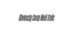
Obviously Blck Italic
Sans SerifDesigned by James Edmondson

Designed by James Edmondson
| Font Name | Obviously Demo Comp |
| Style | Italic |
| Category | Sans Serif |
| Designer | James Edmondson |
| Copyright | N/A |
| License | Demo |
| Total Character | 66 |
| Recommended Line Height | 1.57 |
| Ascent | 1300 |
| Descent | 265 |
| Units Per em | 1000 |
| Total Vertical Range | 1565 |
| Max Advance Width | 281 |
| Max Advance Height | N/A |
| Underline Position | -75 |
| Similar Fonts | Compacta, Impact, Helvetica Compressed, Microgramma |
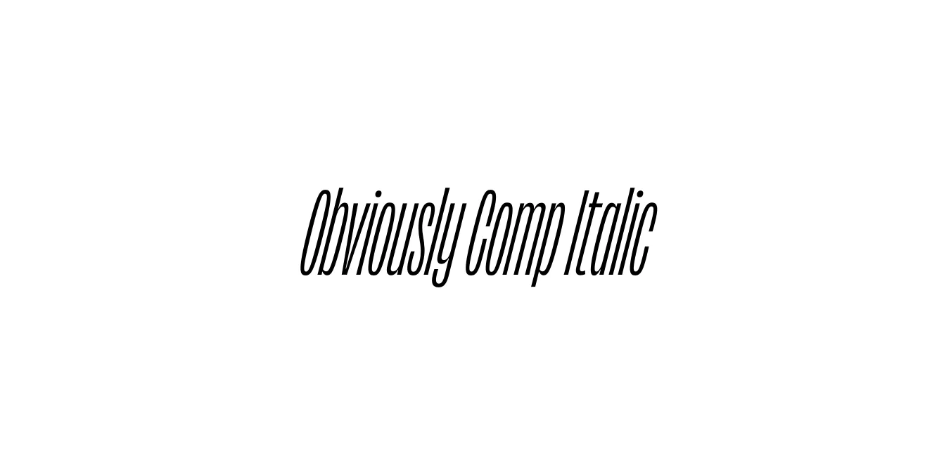
Obviously Comp Italic is a distinctive part of the massive Obviously family designed by James Edmondson for OH no Type Co. The typeface is a modern homage to mid-century American vernacular signage and wood type, specifically focusing on the varying widths and expressive weights that defined 20th-century commercial lettering. This compressed italic version offers a sharp, energetic slant that maximizes space efficiency without sacrificing personality or visual weight.
The design of Obviously Comp Italic excels in editorial and high-impact environments where verticality is a priority. It manages to balance a gritty, utilitarian aesthetic with a high-fashion sensibility, making it a favorite for contemporary designers. Its tight curves and aggressive lean provide a sense of speed and urgency, ensuring that headlines and branding elements stand out in crowded digital or print layouts.
Perfect for high-density magazine headers and vertical callouts.
Ideal for fast-paced, aggressive team logos and promotional graphics.
Excellent for punchy retail signage and high-impact posters.
Great for product labels that require a bold, compact personality.

Package Size: 8.1 KB
Available Formats: .OTF
Designed by James Edmondson
Designed by James Edmondson

Designed by James Edmondson
Designed by James Edmondson