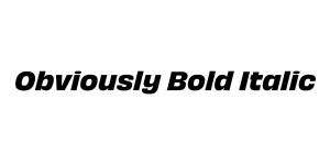
Obviously Bold Italic
Sans SerifDesigned by James Edmondson
Designed by James Edmondson
| Font Name | Obviously Demo Cond Bold |
| Style | Bold Italic |
| Category | Sans Serif |
| Designer | James Edmondson |
| Copyright | N/A |
| License | Free for Personal Use |
| Total Character | 66 |
| Recommended Line Height | 1.57 |
| Ascent | 1300 |
| Descent | 265 |
| Units Per em | 1000 |
| Total Vertical Range | 1565 |
| Max Advance Width | 476 |
| Max Advance Height | N/A |
| Underline Position | -75 |
| Similar Fonts | Impact, Druk, Compacta, Helvetica Compressed |
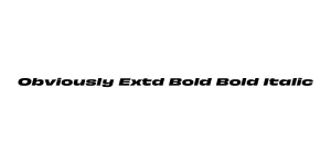
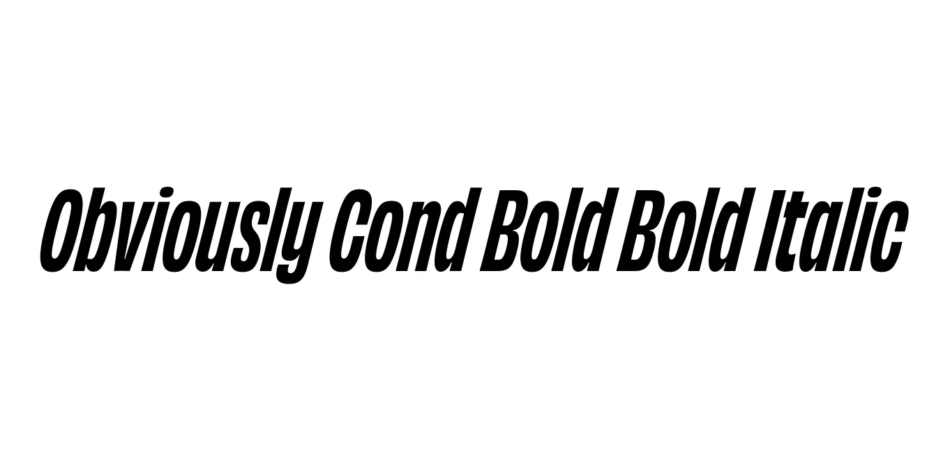
Obviously was designed by James Edmondson and released through the OH no Type Co in 2018. The family was built to be a workhorse with a massive range of widths and weights, capturing the spirit of mid-century American signage while incorporating modern architectural precision. The Obviously Cond Bold Bold Italic variant is particularly noted for its high-energy, slanted appearance that provides a sense of speed and forward momentum.
The design features a very large x-height and short descenders, which allows for extremely tight leading and high-impact vertical stacks. This specific condensed bold italic weight is engineered for display use, where every character needs to communicate strength and urgency. It has become a favorite among designers for its ability to look both vintage and futuristic simultaneously, making it a versatile tool for contemporary branding projects.
Perfect for bold, attention-grabbing titles in magazines or digital editorial content.
Ideal for athletic logos, jersey typography, and high-energy marketing campaigns.
Excellent for high-visibility promotional materials and large-scale posters.
Great for creating high-impact text overlays on vertical video and mobile graphics.

Package Size: 8.6 KB
Available Formats: .OTF
Designed by James Edmondson
Designed by James Edmondson
Designed by James Edmondson