Optien Regular
Designed by Ray Larabie (Typodermic Fonts)
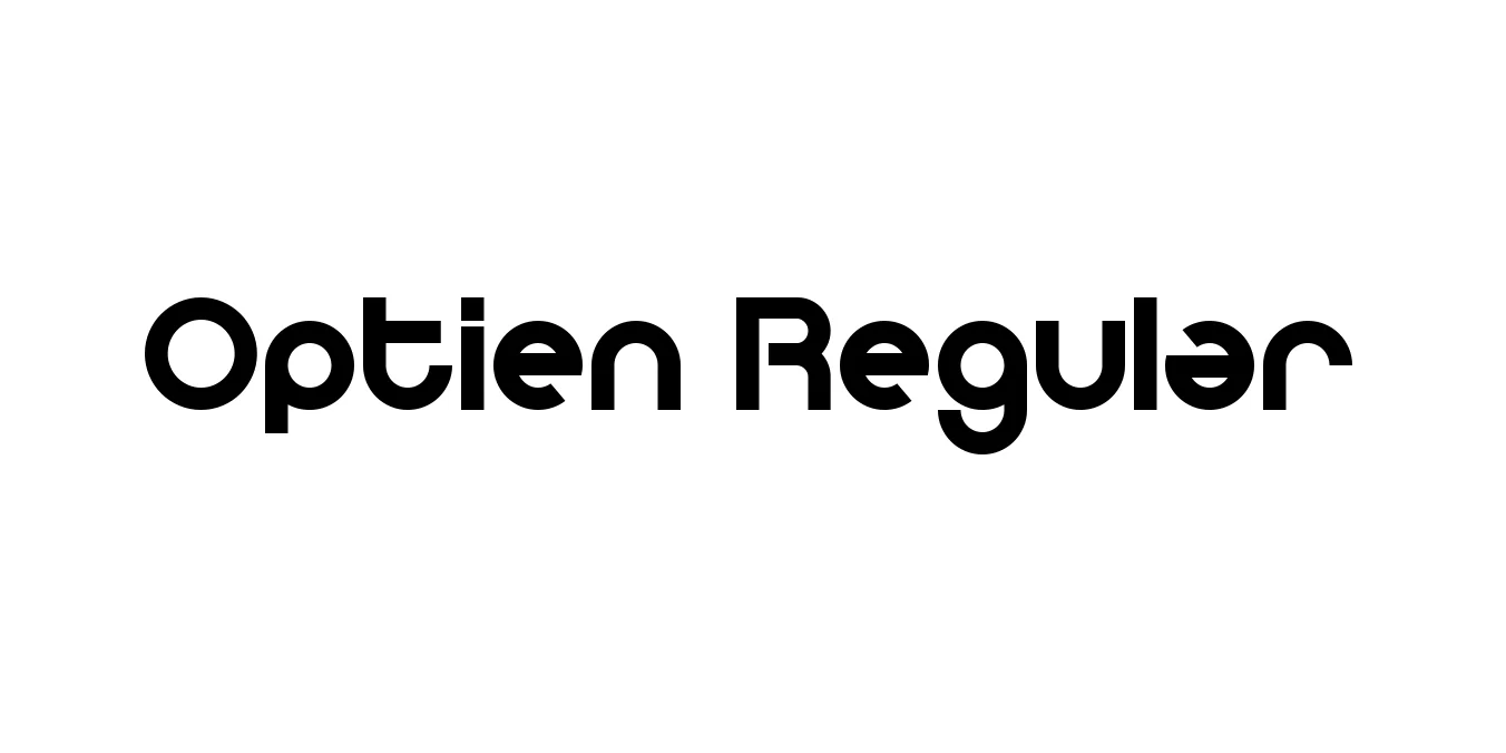
| Font Name | Optien |
| Style | Regular |
| Category | Sans Serif |
| Designer | Ray Larabie (Typodermic Fonts) |
| Copyright | Copyright (c) 2011 by Måns Grebäck. All rights reserved. Personal use only! Mail [email protected] for commercial license |
| License | Free for Personal Use |
| Total Character | 448 |
| Recommended Line Height | 1.3 |
| Ascent | 953 |
| Descent | 350 |
| Units Per em | 1000 |
| Total Vertical Range | 1303 |
| Max Advance Width | 1003 |
| Max Advance Height | N/A |
| Underline Position | -75 |
| Similar Fonts | Eurostile, Bank Gothic, Michroma, Microgramma |
Optien Regular Font Details : Font Free Download
Optien Regular is a sleek, wide-bodied sans-serif typeface that draws heavy inspiration from mid-century modernist architecture and futuristic design aesthetics. Developed by Ray Larabie, the font features squared-off curves and open apertures, providing a sense of technological sophistication and clarity. Its balanced proportions make it particularly effective for display purposes where a clean, machine-like appearance is desired.
The typeface is part of a larger family designed to excel in both print and digital environments. Over the years, Optien has become a favorite among graphic designers working in the tech and gaming industries due to its legibility and modern flair. Whether used for branding or user interface design, it maintains a distinct personality that bridges the gap between retro-futurism and contemporary minimalism.
Optien Regular Best Uses
Ideal for high-tech startup logos and corporate identities.
Perfect for HUDs, menu interfaces, and futuristic game titles.
Bold headlines that require a clean, architectural look.
Effective for large-scale outdoor signage and tech promotions.
Optien Regular Glyphs

Download Font
Package Size: 67.9 KB
Available Formats: .TTF