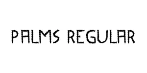
Palms Regular
ScriptDesigned by Letterara
Designed by A.M. Cassandre
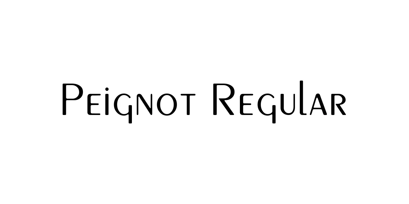
| Font Name | Peignot |
| Style | Regular |
| Category | Sans Serif |
| Designer | A.M. Cassandre |
| Copyright | The programs to draw the splines of this font are Copyright © 1999 by George Williams |
| License | Free for Personal Use |
| Total Character | 253 |
| Recommended Line Height | 1.03 |
| Ascent | 815 |
| Descent | 214 |
| Units Per em | 1000 |
| Total Vertical Range | 1029 |
| Max Advance Width | 1074 |
| Max Advance Height | N/A |
| Underline Position | -133 |
| Similar Fonts | Bernhard Fashion, Broadway, Cassandre, Futura |
Peignot Regular is a seminal sans-serif typeface designed in 1937 by the legendary French poster artist A.M. Cassandre for the Deberny & Peignot foundry. The font is most notable for its experimental 'multi-case' structure, which eschews traditional lowercase forms in favor of smaller-scale uppercase letters for characters like 'a', 'e', and 'g'. This unique design was intended to revive the elegance of monumental Latin inscriptions while maintaining a modernist, geometric simplicity.
Throughout the 20th century, Peignot became synonymous with French Art Deco and mid-century modernism. It reached a height of popular culture fame in the 1970s as the typeface used for the title sequence of 'The Mary Tyler Moore Show'. Today, it remains a go-to choice for designers seeking a blend of classic sophistication and avant-garde flair, particularly in high-fashion branding and editorial contexts.
Perfect for stylish magazine headlines and section headers.
Ideal for high-end fashion logos and cosmetic packaging.
Excellent for bold, artistic statements in exhibition or cinema posters.
Distinctive enough for television and film opening credits.

Designed by Letterara
Designed by A.S. Meijer

Designed by DynaComware
Designed by Clement Nicolle (Stereo Type)