Poker In October Regular
Designed by Hanoded (David Kerkhoff)
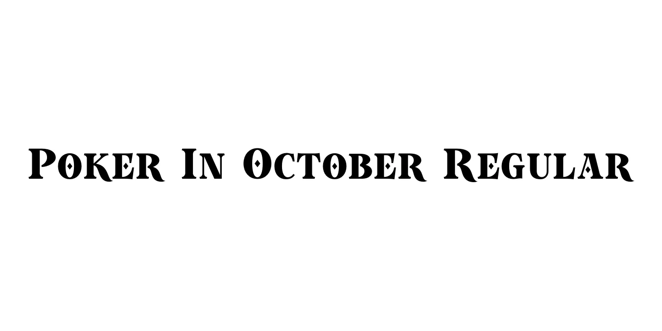
| Font Name | Poker In October Demo |
| Style | Regular |
| Category | Hand-drawn / Display |
| Designer | Hanoded (David Kerkhoff) |
| Copyright | Copyright © 2018 by Roland Hüse. All rights reserved. |
| License | Free for Personal Use |
| Total Character | 63 |
| Recommended Line Height | 1.2 |
| Ascent | 1000 |
| Descent | 200 |
| Units Per em | 1000 |
| Total Vertical Range | 1200 |
| Max Advance Width | 1266 |
| Max Advance Height | N/A |
| Underline Position | -75 |
| Similar Fonts | Rough Draft, Wild Wood, Marker Felt |
Poker In October Regular Font Details : Font Free Download
Poker In October Regular is a distinctively hand-drawn display typeface created by the prolific Dutch designer David Kerkhoff of Hanoded. The font carries a raw, energetic aesthetic characterized by its slightly uneven strokes and organic letterforms, which give it a genuine handmade feel. This typeface was designed to capture a sense of spontaneity and informality, making it stand out from rigid, digitally-perfect fonts in the display category.
As a versatile display font, Poker In October is particularly effective for projects that require a touch of personality and warmth. It excels in contexts like book covers, movie posters, and creative headlines where a quirky or rugged vibe is desired. While it maintains high legibility for short bursts of text, its true strength lies in its ability to add a human element to digital designs, bridging the gap between graphic art and traditional calligraphy.
Poker In October Regular Best Uses
Ideal for creating high-impact, energetic headlines that demand attention.
Perfect for artisanal brands looking for a custom, approachable visual identity.
Great for eye-catching quotes and thumb-stopping Instagram graphics.
Adds a unique, artistic character to young adult fiction or creative non-fiction titles.
Poker In October Regular Glyphs
