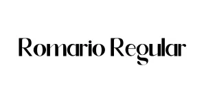
Kingstone Regular
SerifDesigned by Letterhend Studio

Designed by Jeremy Dooley
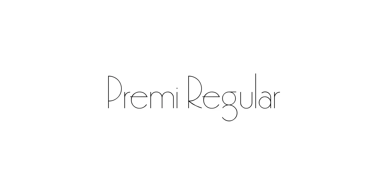
| Font Name | Premi |
| Style | Regular |
| Category | Serif |
| Designer | Jeremy Dooley |
| Copyright | Converted by ALLTYPE |
| License | Free for Personal Use |
| Total Character | 394 |
| Recommended Line Height | 1.13 |
| Ascent | 773 |
| Descent | 358 |
| Units Per em | 1000 |
| Total Vertical Range | 1131 |
| Max Advance Width | 980 |
| Max Advance Height | N/A |
| Underline Position | -80 |
| Similar Fonts | Bodoni, Didot, Playfair Display |
Premi Regular is a refined and elegant typeface designed to bridge the gap between classical serif traditions and contemporary digital design needs. Developed with meticulous attention to detail, it features high contrast between thick and thin strokes, giving it a sophisticated air that is perfect for luxury branding and high-end editorial layouts. The font's geometric underpinnings ensure clarity even at smaller sizes, making it a versatile choice for both print and screen applications.
As part of a broader type family, Premi Regular focuses on legibility and stylistic flair. Its proportions are influenced by the transition from old-style to modern serifs, resulting in a timeless look that avoids feeling dated. Whether used for a minimalist logo or a detailed magazine spread, Premi Regular provides a clean, professional aesthetic that elevates any creative project with its balanced weight and graceful curves.
Perfect for high-end fashion and premium lifestyle brand identities.
Ideal for magazine headers, feature stories, and body text.
Adds a touch of class and sophistication to high-quality stationery.
Excellent for clean, readable headings on minimalist or portfolio websites.

Designed by Letterhend Studio
Designed by Modular InfoTech Pvt. Ltd.
Designed by Mans Greback
Designed by Lettermama