Neom Regular
Sans-serifDesigned by Dalton Maag

Designed by Monotype Design Studio
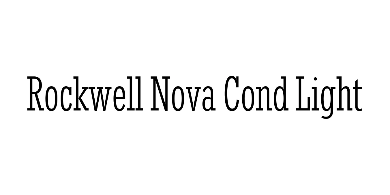
| Font Name | Rockwell Nova Cond Light |
| Style | Regular |
| Category | Slab Serif |
| Designer | Monotype Design Studio |
| Copyright | © 2014 The Monotype Corporation. All Rights Reserved. |
| License | Free for Personal Use |
| Total Character | 509 |
| Recommended Line Height | 1.32 |
| Ascent | 2099 |
| Descent | 600 |
| Units Per em | 2048 |
| Total Vertical Range | 2699 |
| Max Advance Width | 1769 |
| Max Advance Height | N/A |
| Underline Position | -205 |
| Similar Fonts | Archer, Memphis, Stymie, Clarendon |
Rockwell Nova Cond Light is a contemporary update to the iconic Rockwell typeface, which was originally released by the Monotype Corporation in 1934. The Rockwell family is one of the most famous examples of a geometric slab serif, characterized by its sturdy, block-like serifs and clean, monolinear stroke weights. The 'Nova' version was developed to expand the utility of the original face, providing more versatile weights and widths for modern high-resolution screens and complex print layouts.
The Condensed Light variant specifically offers a more elegant and space-efficient interpretation of the classic slab serif structure. While the original Rockwell is known for its heavy presence, this lighter, condensed weight allows for a sophisticated aesthetic that maintains high legibility even in tight spaces. It is particularly valued by designers for its ability to convey a sense of authority and modernity without the visual weight of the traditional bold slabs.
Creates striking and space-saving titles for magazine covers and news headers.
Provides a unique, professional look for corporate identities and logos.
Excellent for subheaders, pull quotes, and sidebar text where space is limited.
Perfect for clean, modern navigation menus and UI headings.

Designed by Dalton Maag
Designed by Nick Curtis
Designed by Dan Zadorozny (Iconian Fonts)

Designed by Ray Larabie