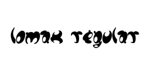
Lomax Regular
Sans SerifDesigned by Alan Meeks
Designed by W Foundry
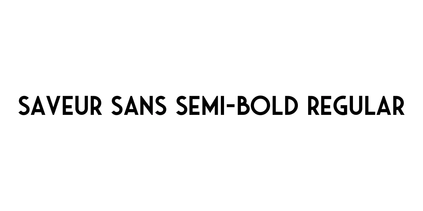
| Font Name | Saveur Sans Semi-bold |
| Style | Regular |
| Category | Sans Serif |
| Designer | W Foundry |
| Copyright | SaveurSans (C) Andrew Footit. 2016. All Rights Reserved |
| License | Free for Personal Use |
| Total Character | 301 |
| Recommended Line Height | 1.08 |
| Ascent | 1785 |
| Descent | 420 |
| Units Per em | 2048 |
| Total Vertical Range | 2205 |
| Max Advance Width | 3284 |
| Max Advance Height | N/A |
| Underline Position | -217 |
| Similar Fonts | Futura, Brandon Grotesque, Neutraface |
Saveur Sans Semi-bold Regular is a sophisticated sans-serif typeface heavily inspired by the culinary world and the timeless Art Deco aesthetics of mid-century Europe. Developed by the renowned W Foundry, this font captures the refined elegance of classic French bistros and upscale gourmet packaging. Its clean, geometric construction is balanced by unique character details that provide a modern yet nostalgic feel, making it a standout choice for designers seeking to convey luxury and taste.
The Semi-bold weight specifically offers a robust presence without losing the grace inherent in the Saveur Sans family. It is meticulously crafted to bridge the gap between vintage modernist styles and contemporary display typography. Whether used in high-end editorial layouts, hospitality branding, or digital interfaces, Saveur Sans brings a distinctively polished and professional atmosphere to any creative project.
Ideal for luxury logos, high-end corporate identities, and fashion branding.
Perfect for magazine headlines, stylish titles, and sophisticated pull quotes.
Excellent for premium food, beverage, and cosmetic label designs.
Great for hero sections and navigation menus on upscale websites.

Designed by Alan Meeks
Designed by Besarion Paata Gugushvili (BPG InfoTech)
Designed by Dan Cassaro
Designed by Eric Olson