Scholar Italic
Designed by David Quay
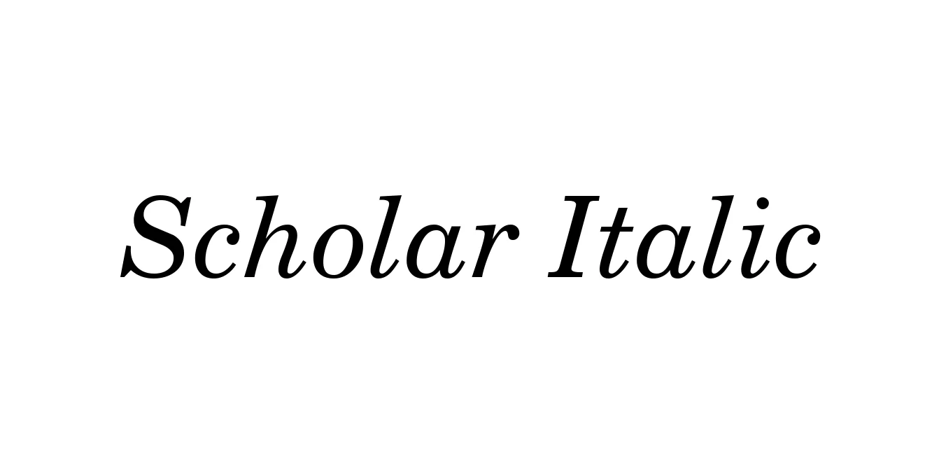
| Font Name | Scholar |
| Style | Italic |
| Category | Serif |
| Designer | David Quay |
| Copyright | From the WSI-Font Collection. Copyright (c)1995 Weatherly Systems, Inc. All Rights Reserved. Redistribution strictly prohibited. |
| License | Free for Personal Use |
| Total Character | 228 |
| Recommended Line Height | 1.2 |
| Ascent | 968 |
| Descent | 227 |
| Units Per em | 1000 |
| Total Vertical Range | 1195 |
| Max Advance Width | 1200 |
| Max Advance Height | N/A |
| Underline Position | -70 |
| Similar Fonts | Baskerville, ITC New Baskerville, Mrs Eaves |
Scholar Italic Font Details : Font Free Download
Scholar Italic is a sophisticated transitional serif typeface that draws inspiration from the classic typographic traditions of the 18th century. Designed by the renowned David Quay, this font family was crafted to provide an authoritative yet accessible voice for scholarly and literary publications. The italic weight is particularly celebrated for its graceful, rhythmic flow and calligraphic nuances, which offer a distinct contrast to its upright counterpart while maintaining a cohesive visual language.
Throughout its history, Scholar Italic has been favored by publishers for its exceptional legibility and refined proportions. Its design features a moderate contrast in stroke weight and sharp, well-defined serifs that ensure clarity even at smaller point sizes. This makes it an indispensable tool for editorial designers who require a font that conveys a sense of timeless elegance and academic rigor, whether in printed journals, high-end branding, or digital platforms.
Scholar Italic Best Uses
Ideal for long-form text in magazines and academic journals.
Perfect for literary novels and scholarly footnotes.
Used to create a sophisticated and trustworthy corporate identity.
Adds a refined touch to formal invitations and letterheads.
Scholar Italic Glyphs
