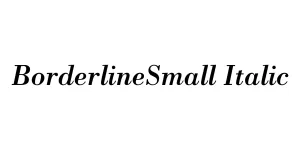
BorderlineSmall Italic
Script / DisplayDesigned by Vladimir Nikolic
Designed by Steve Matteson
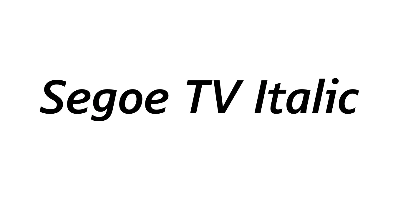
| Font Name | Segoe TV |
| Style | Italic |
| Category | Sans Serif |
| Designer | Steve Matteson |
| Copyright | Digitized data copyright © 1997 to 2004 Microsoft Corporation. All Rights Reserved. |
| License | Free for Personal Use |
| Total Character | 383 |
| Recommended Line Height | 1.22 |
| Ascent | 2003 |
| Descent | 489 |
| Units Per em | 2048 |
| Total Vertical Range | 2492 |
| Max Advance Width | 2542 |
| Max Advance Height | N/A |
| Underline Position | -237 |
| Similar Fonts | Segoe UI, Frutiger, Myriad Pro, Open Sans |
Segoe TV Italic is a specialized variation of the widely recognized Segoe typeface family, originally designed by Steve Matteson for Microsoft. It was specifically optimized for legibility on television screens and low-resolution displays, ensuring that text remains clear even in the challenging environment of broadcast graphics and user interfaces. The Italic version provides a sophisticated slant that maintains the humanist qualities of the base design while adding emphasis and visual variety to on-screen layouts.
This font gained prominence through its use in early Windows Media Center interfaces and various Microsoft interactive television projects. Its open apertures and generous spacing prevent character blurring, which is a common issue with traditional fonts displayed on CRTs or early digital screens. Today, Segoe TV Italic remains a nostalgic yet functional choice for designers looking to replicate a specific era of digital interface design or seeking a robust sans-serif that prioritizes clarity above all else.
Ideal for lower thirds and on-screen titles.
Perfect for UI elements in legacy-style digital applications.
Works well for emphasized titles in marketing materials.
Provides a clean, tech-focused look for corporate identities.

Package Size: 55.1 KB
Available Formats: .TTF
Designed by Vladimir Nikolic
Designed by Apple Inc.
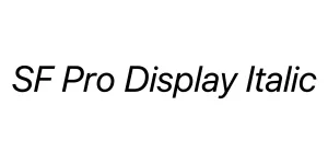
Designed by Apple Inc.

Designed by Mans Greback