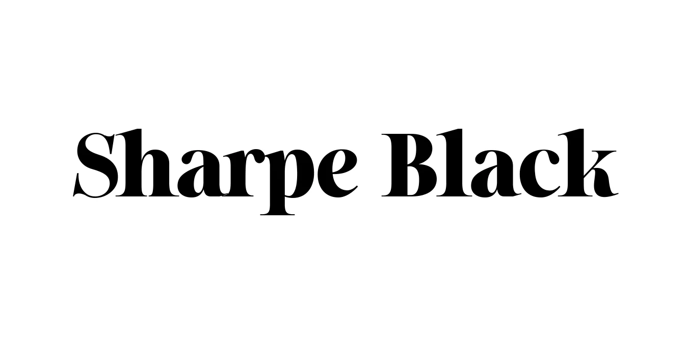
Sharpe Black
Designed by Jeremy Dooley
| Font Name | Sharpe PERSONAL |
| Style | Black |
| Category | Display Serif |
| Designer | Jeremy Dooley |
| Copyright | Copyright (c) 2019 by Mans Greback. All rights reserved. |
| License | Demo |
| Total Character | 362 |
| Recommended Line Height | 1.34 |
| Ascent | 1030 |
| Descent | 308 |
| Units Per em | 1000 |
| Total Vertical Range | 1338 |
| Max Advance Width | 1791 |
| Max Advance Height | N/A |
| Underline Position | -75 |
| Similar Fonts | Bodoni, Didot, Playfair Display, ITC Fenice |
Sharpe Black Font Details : Font Free Download
Sharpe Black is a powerful display serif typeface designed by Jeremy Dooley as part of the extensive Sharpe family. Released through Insignia Design Group, this font represents the pinnacle of high-contrast typography, drawing inspiration from the elegant aesthetic of 19th-century modern serifs. It was specifically engineered to meet the demands of contemporary fashion and editorial design, where dramatic visual impact and refined sophistication are essential for high-end brand storytelling.
The Sharpe Black weight is characterized by its extreme transitions between thick and razor-thin strokes, creating a shimmering effect that is both luxurious and authoritative. Its sharp, needle-like serifs and perfectly balanced proportions make it an ideal choice for large-scale applications where every detail counts. While it pays homage to classic styles like Didot and Bodoni, it incorporates modern precision and spacing that ensures it remains versatile for digital and print media alike.
Sharpe Black Best Uses
Ideal for high-end magazine spreads, cover titles, and lookbooks.
Perfect for logos and brand identities of premium products and services.
Best suited for large-scale typography where its dramatic contrast is highly visible.
Excellent for sophisticated advertising campaigns that require a bold yet refined aesthetic.
Sharpe Black Glyphs

Download Font
Package Size: 117.7 KB
Available Formats: .TTF